Freelance work has given me the chance to help smaller brands shape how they look and feel, creating everything from logos and colour palettes to complete brand identities and guidelines. It’s one of the most rewarding parts of what I do, because these clients have let me grow their brand from the ground up.

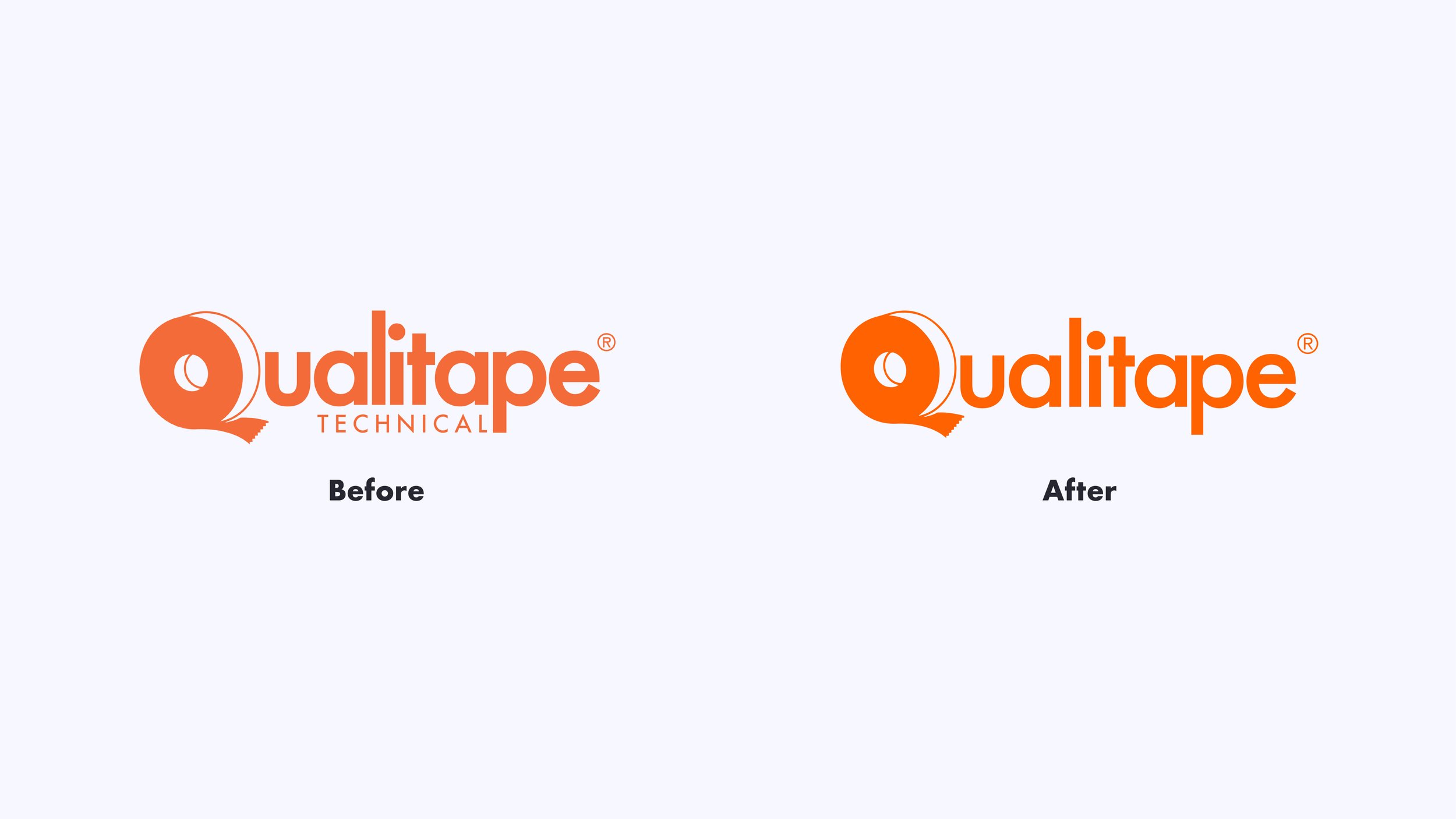
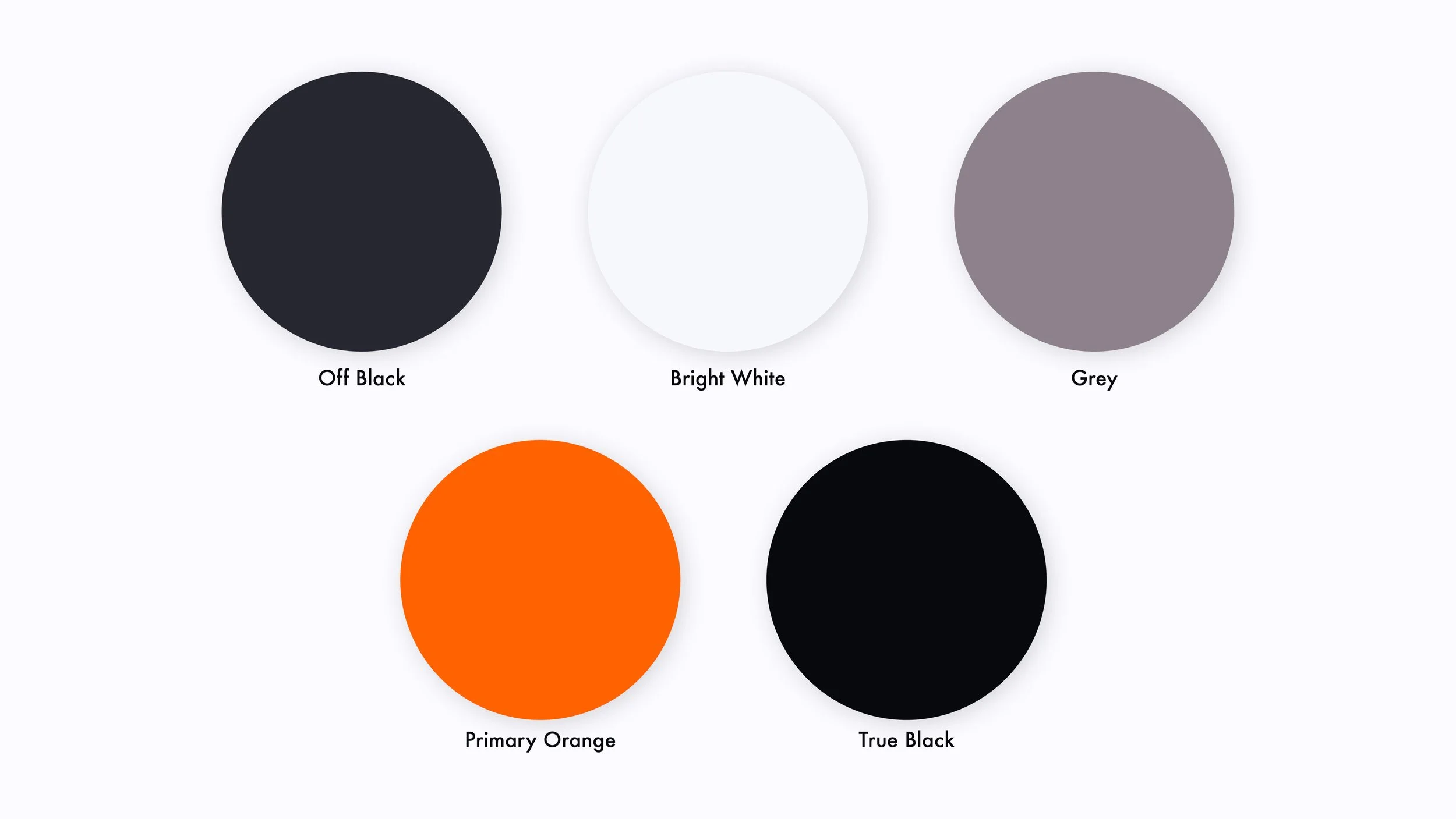
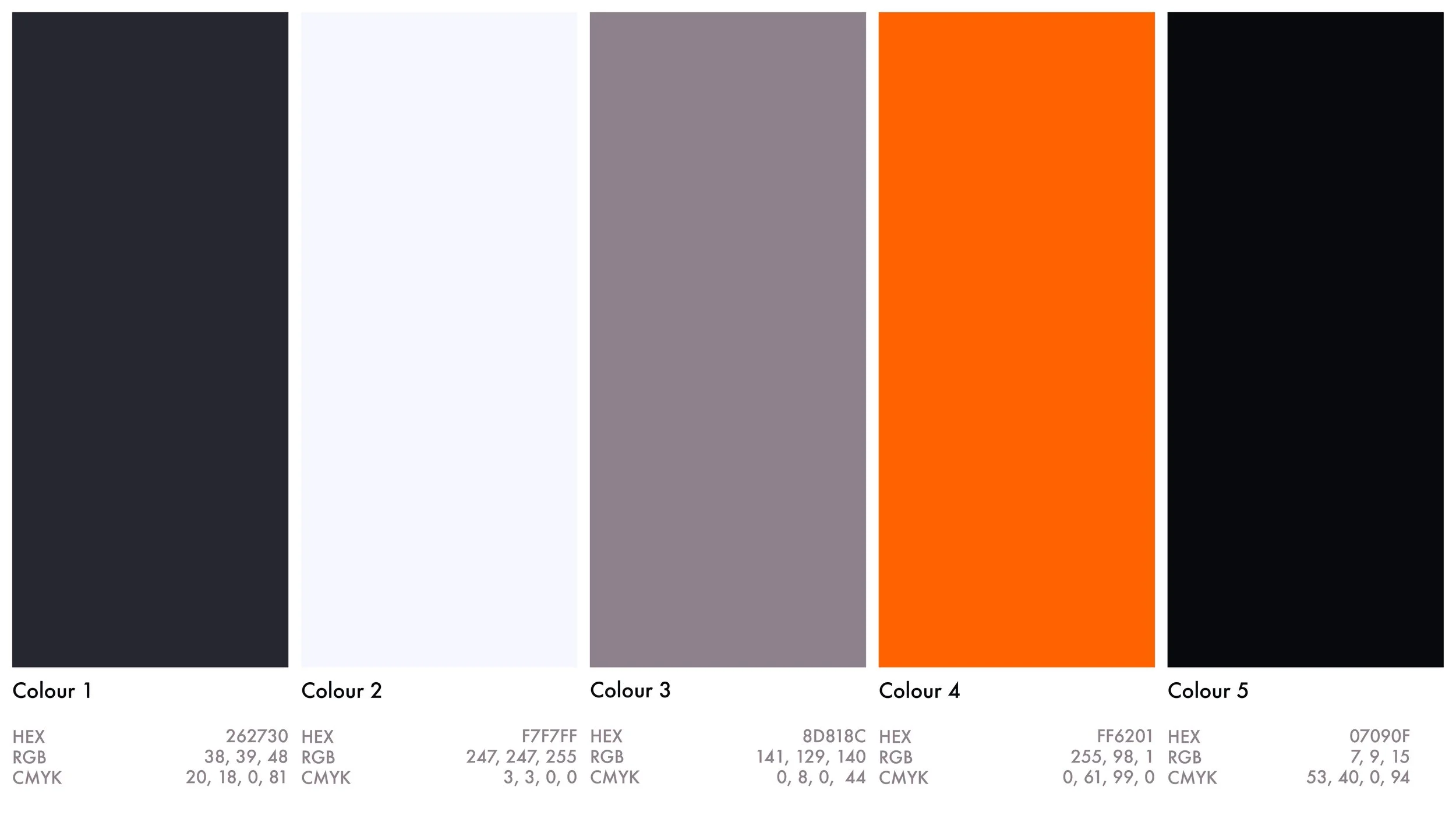
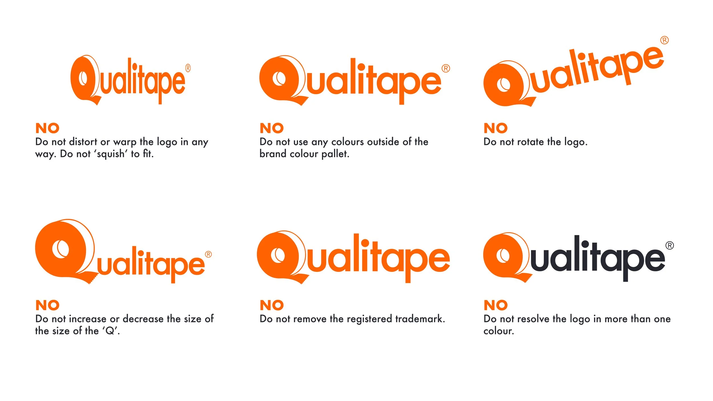
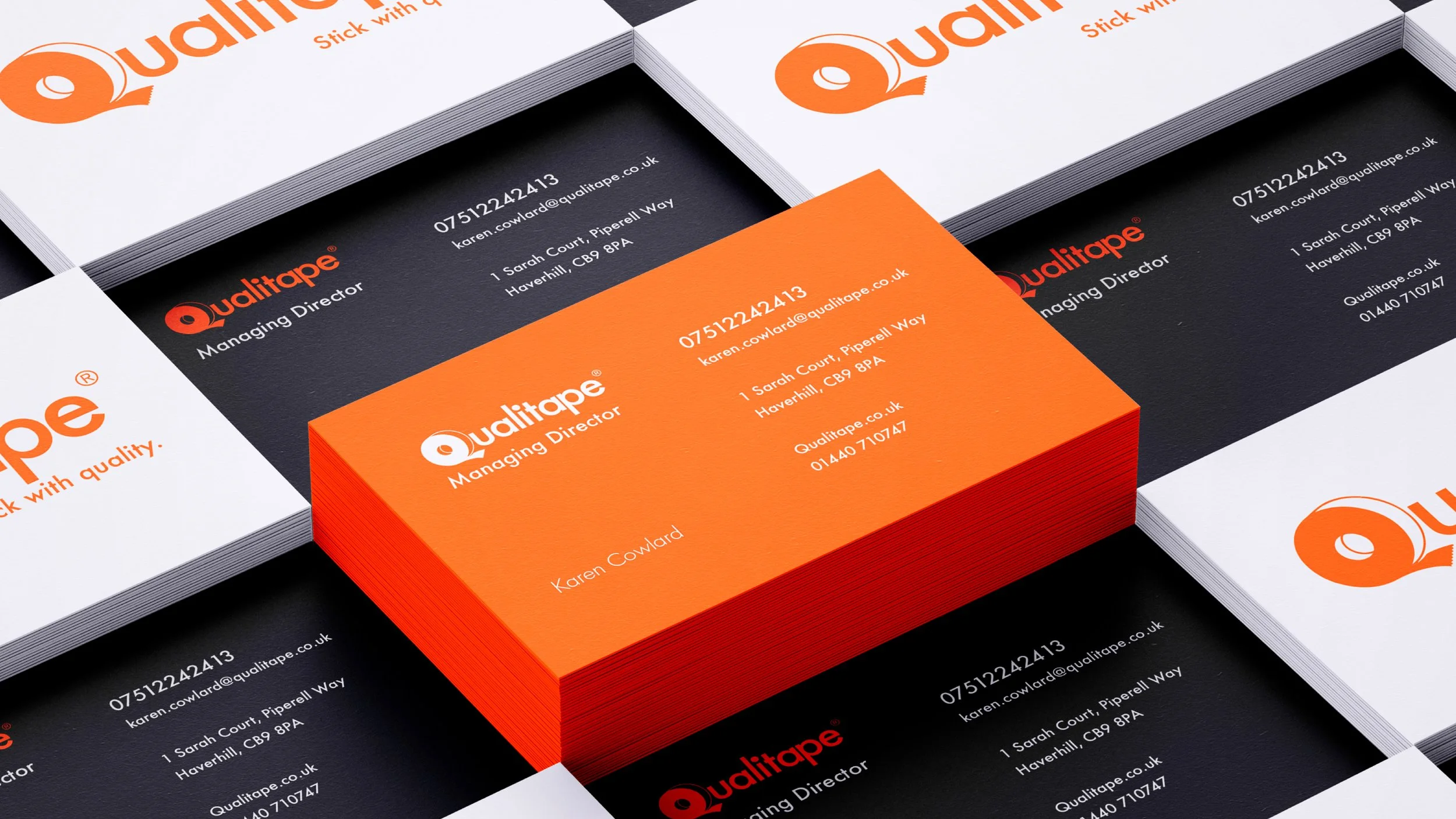
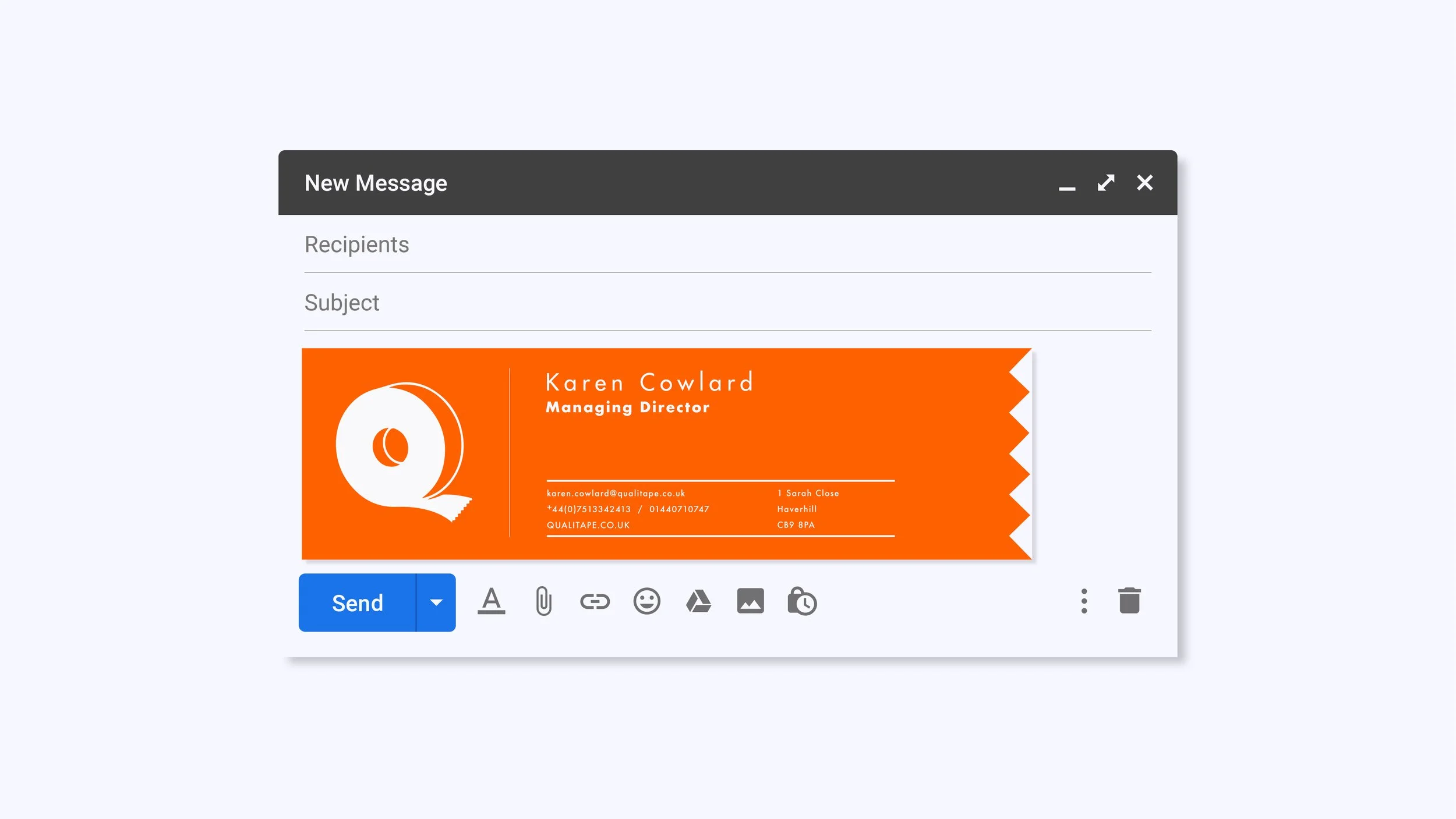
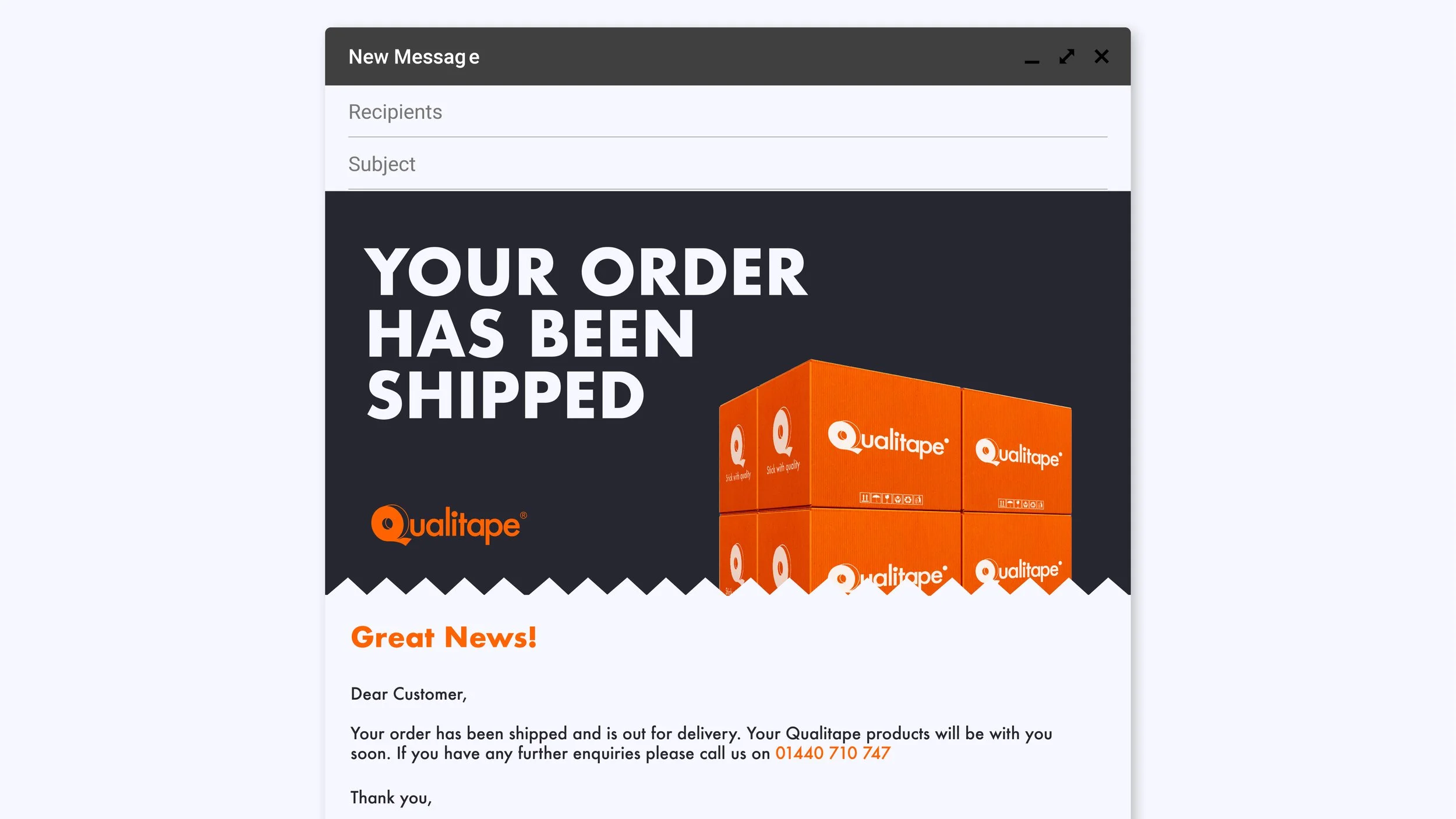
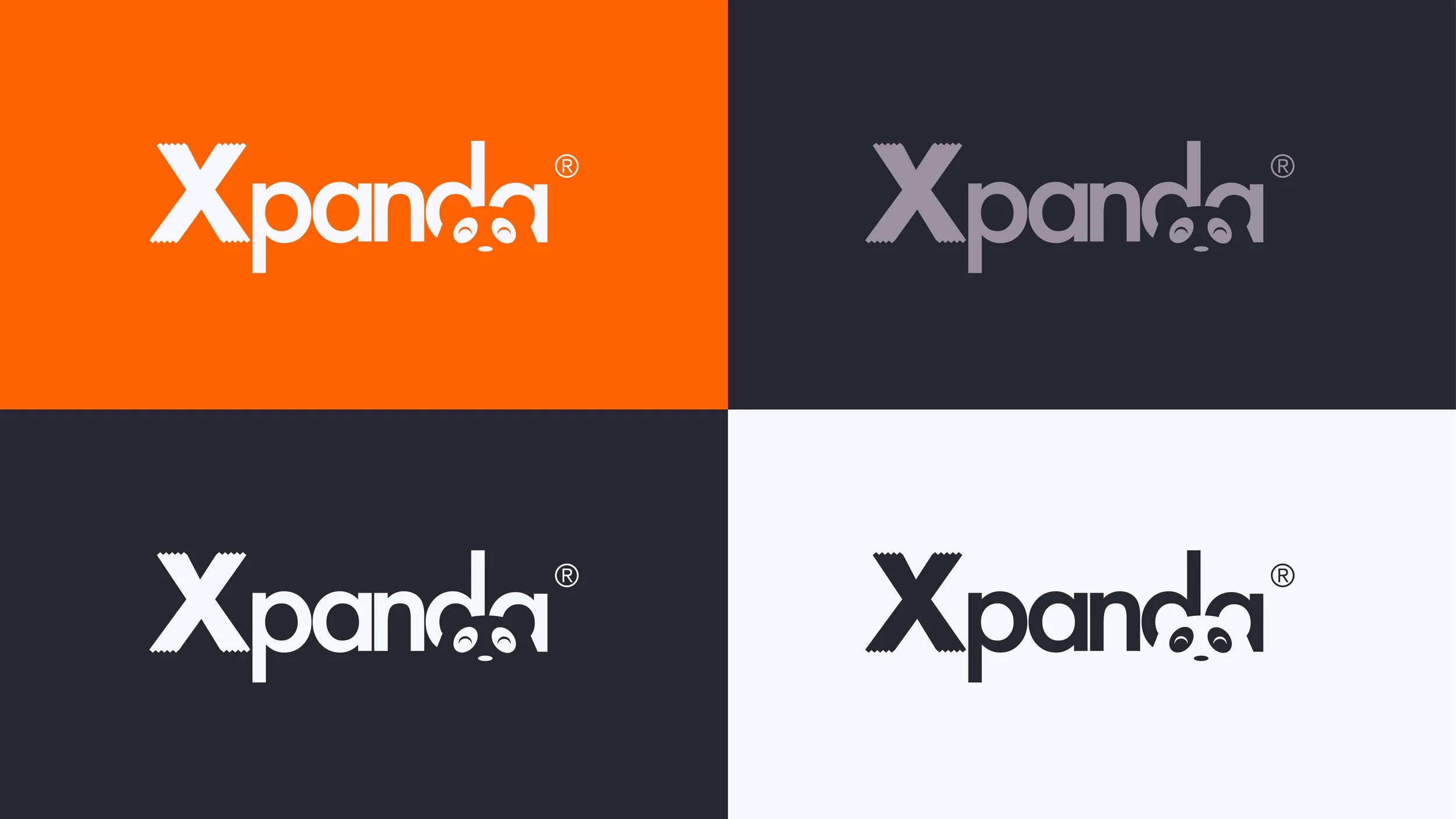
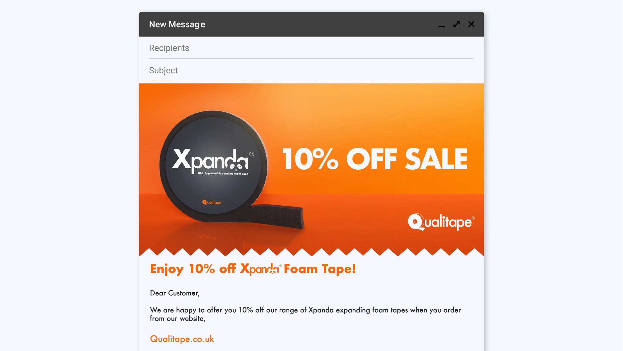
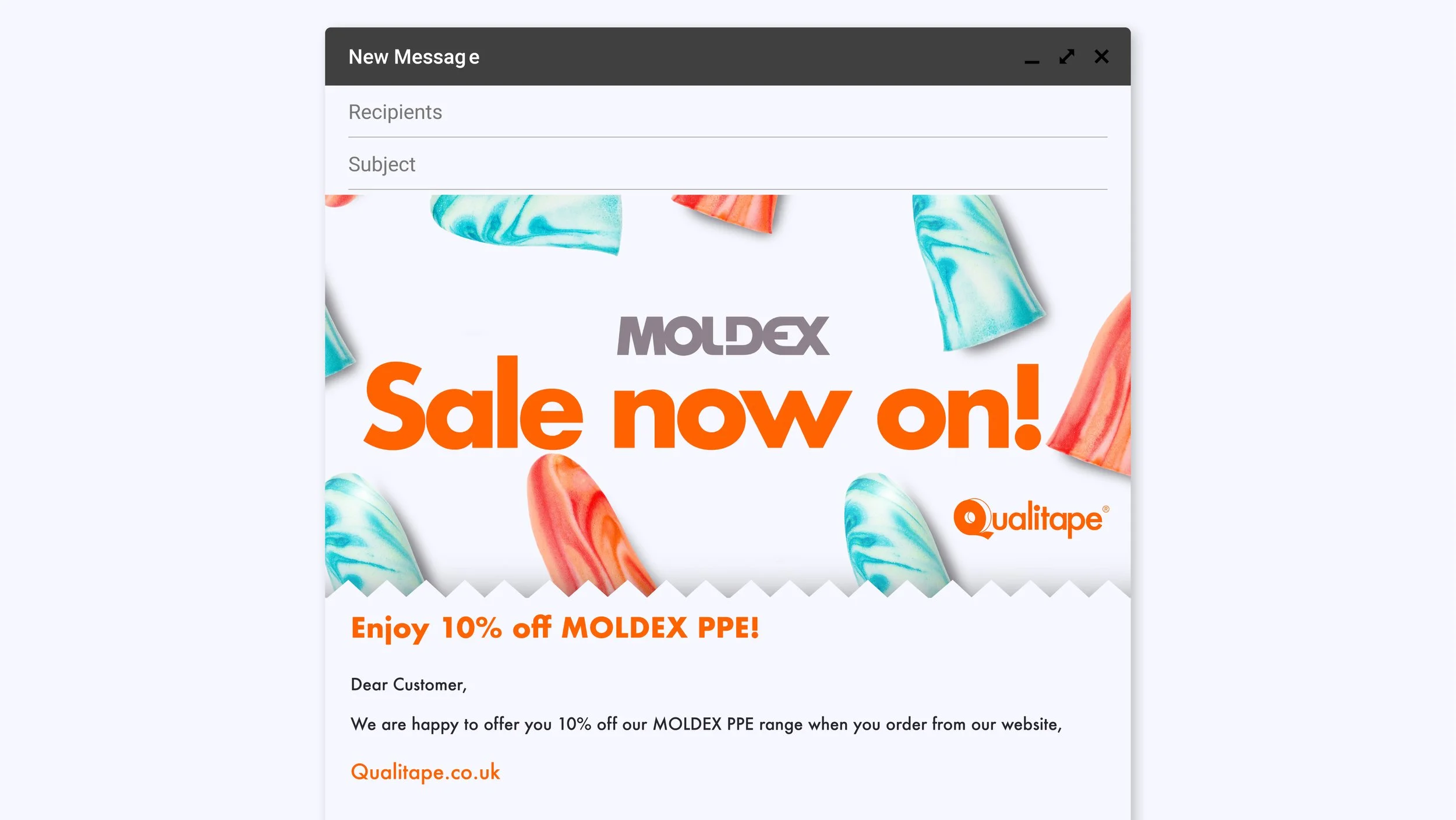
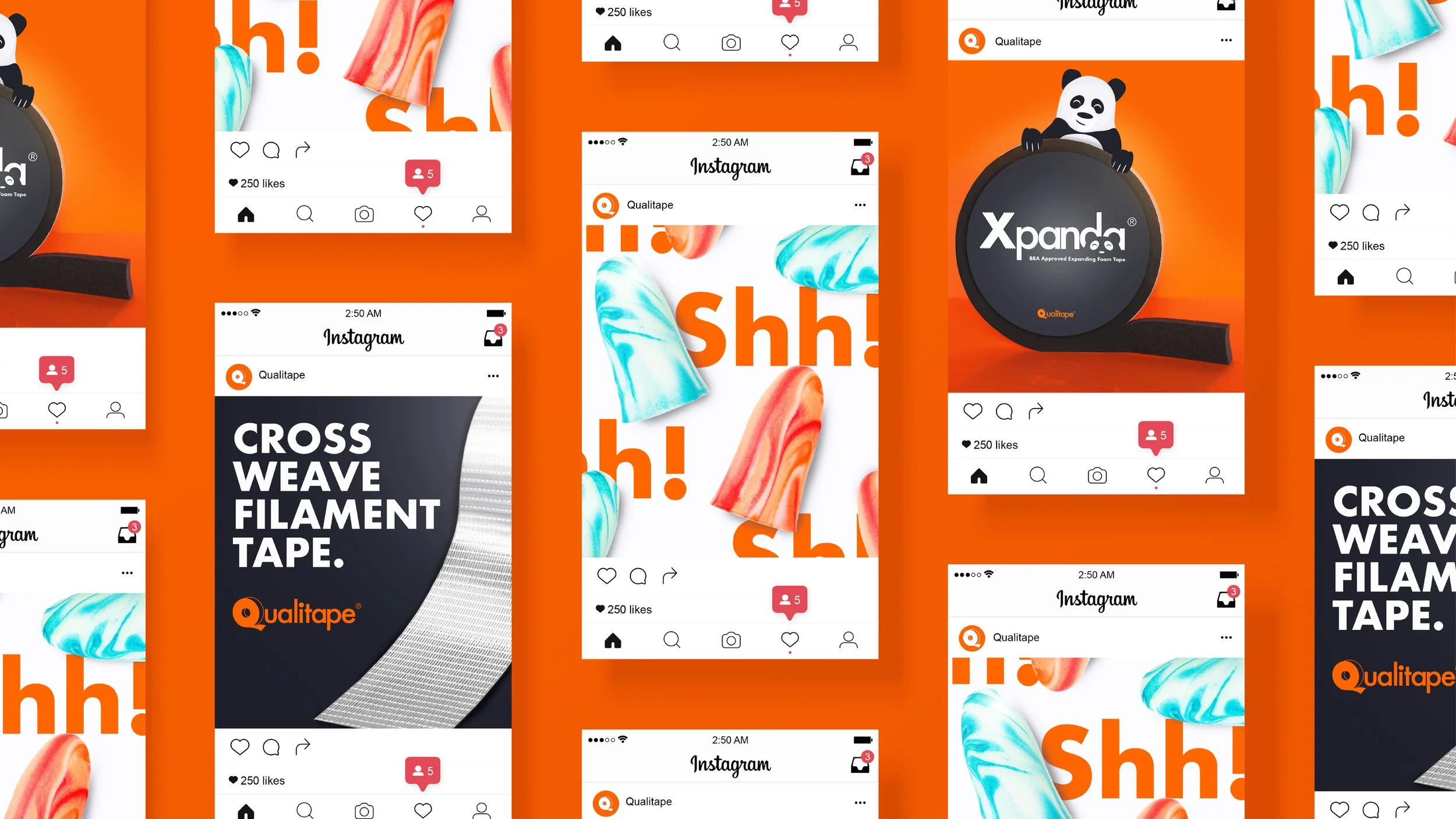
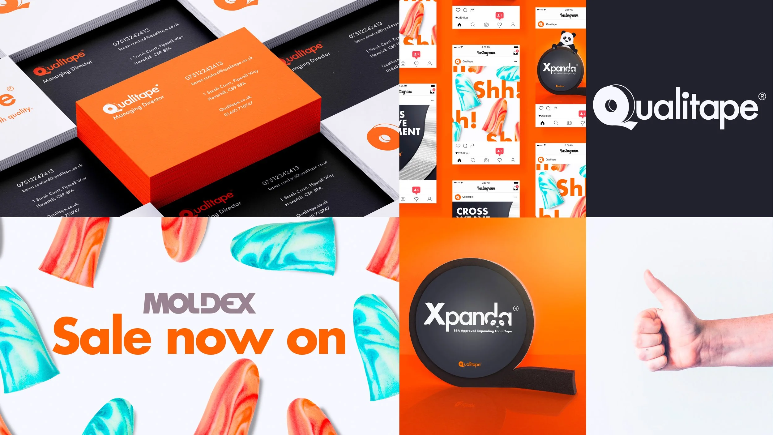
In 2019, I took on Qualitape as my first freelance client, helping refine their existing brand into a clear and consistent visual identity. I created a set of simple brand guidelines and showed how the look and feel could come to life across different assets, making sure everything felt cohesive, considered and professional.

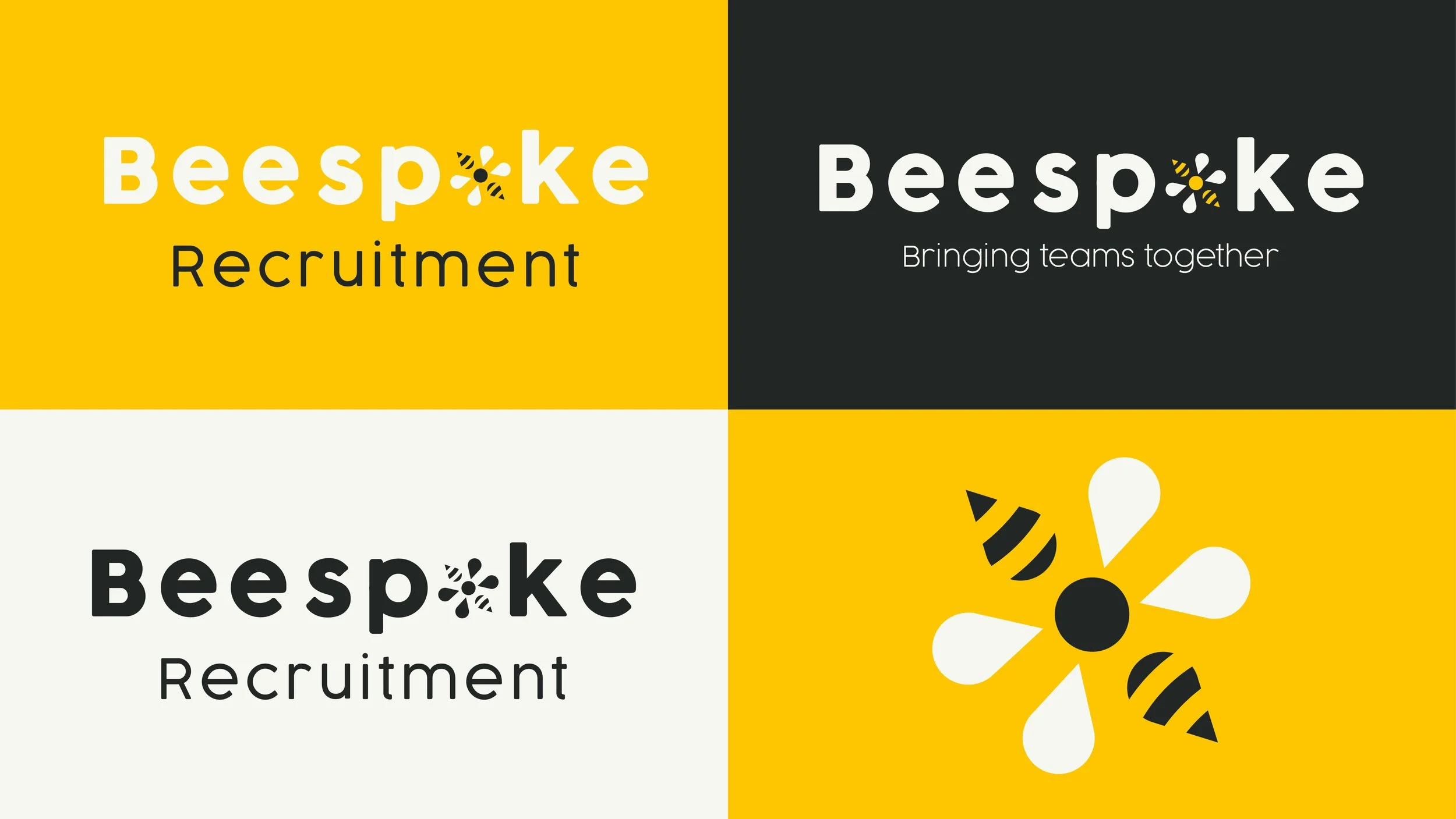
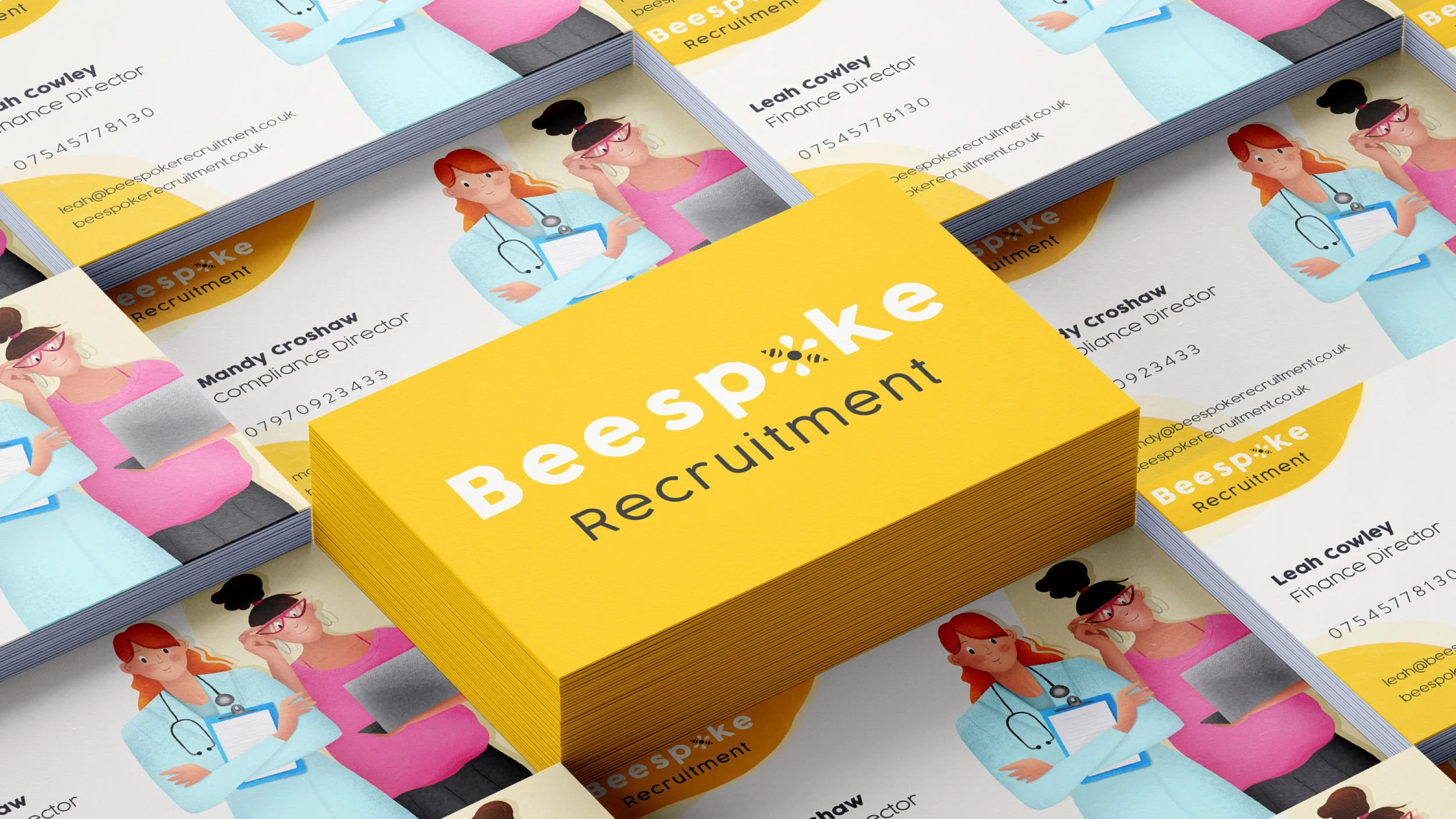
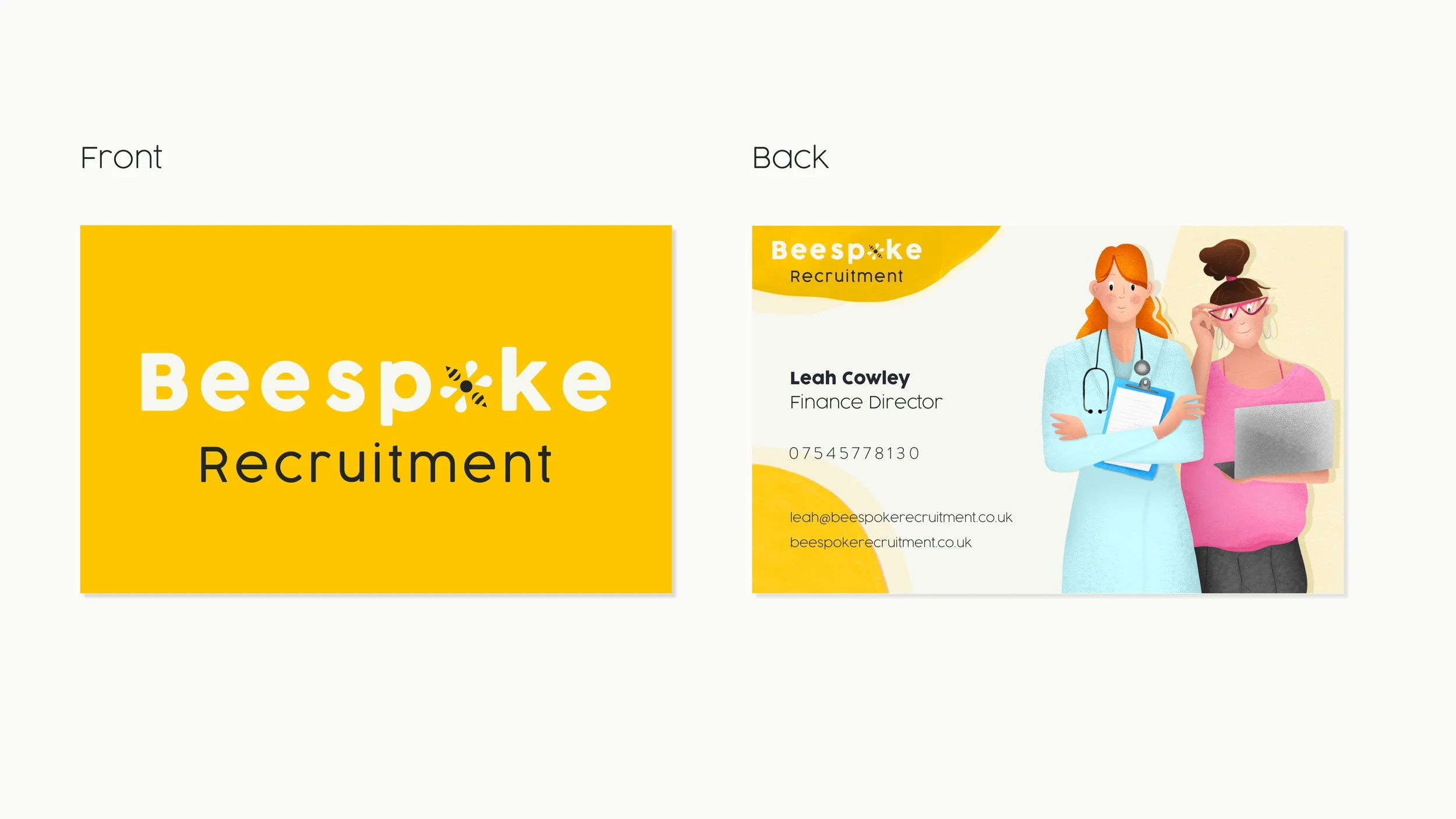
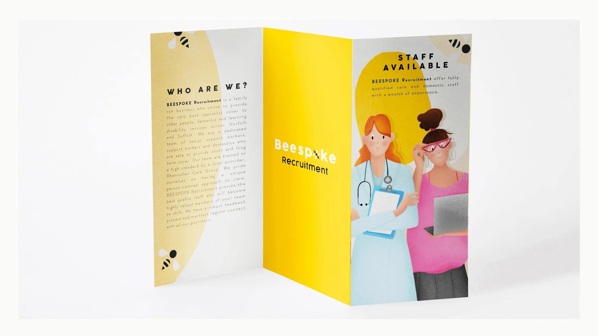
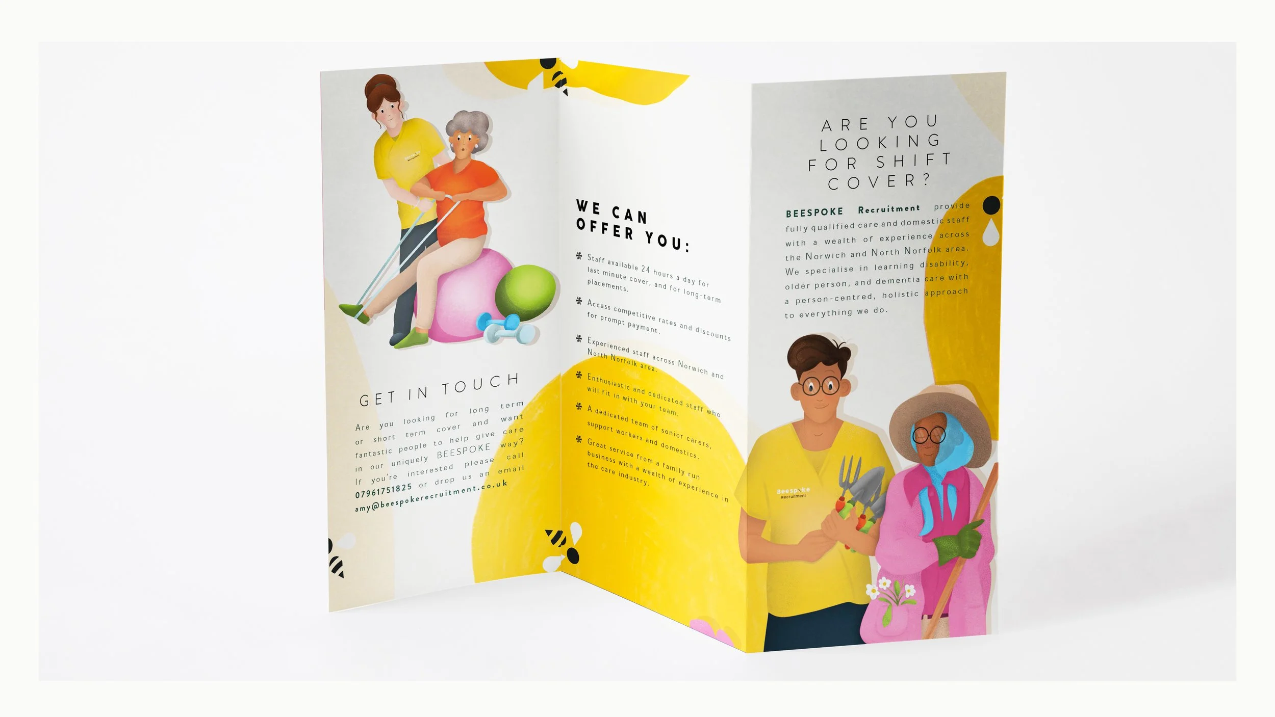
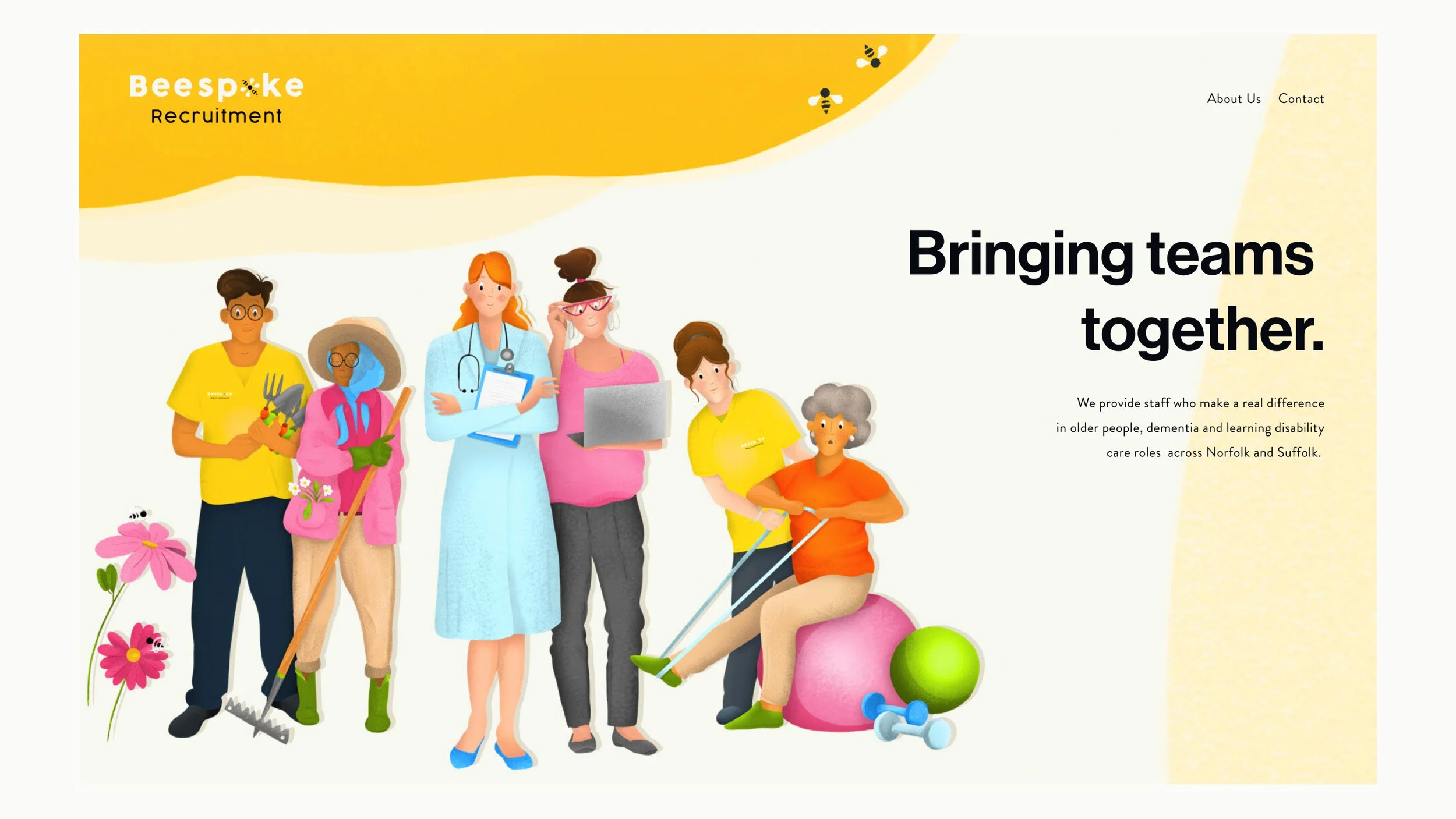
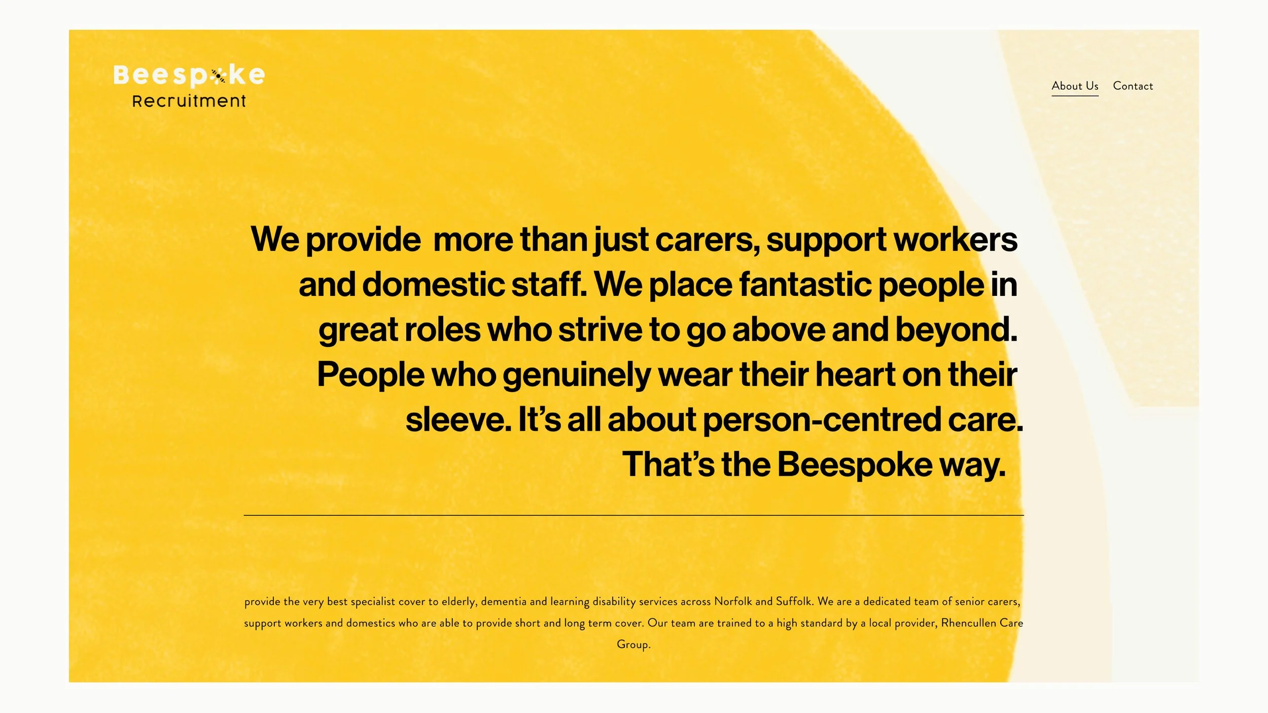
In 2020, I worked with Beespoke Recruitment, a Norfolk-based recruitment agency, to build their brand from the ground up. I created the full visual identity, from the logo and colour palette through to a bespoke illustration style, with every illustration drawn by me specifically for the brand. I developed a library of original characters and visual assets that could be used across social, print and digital communications, helping give the business a warm, approachable and recognisable personality while keeping everything consistent and professional.
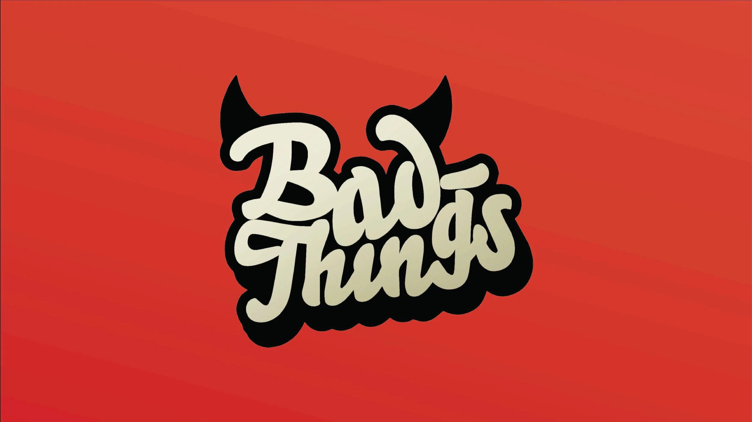
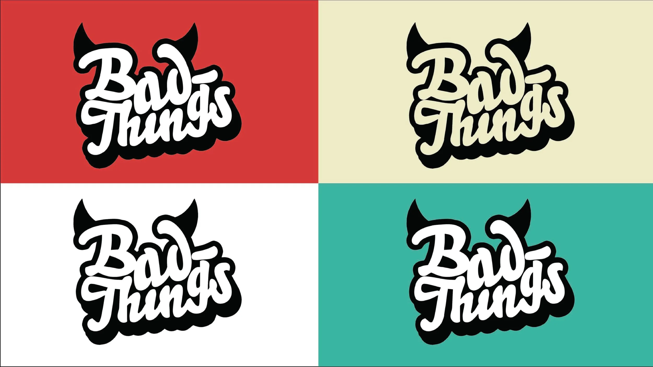
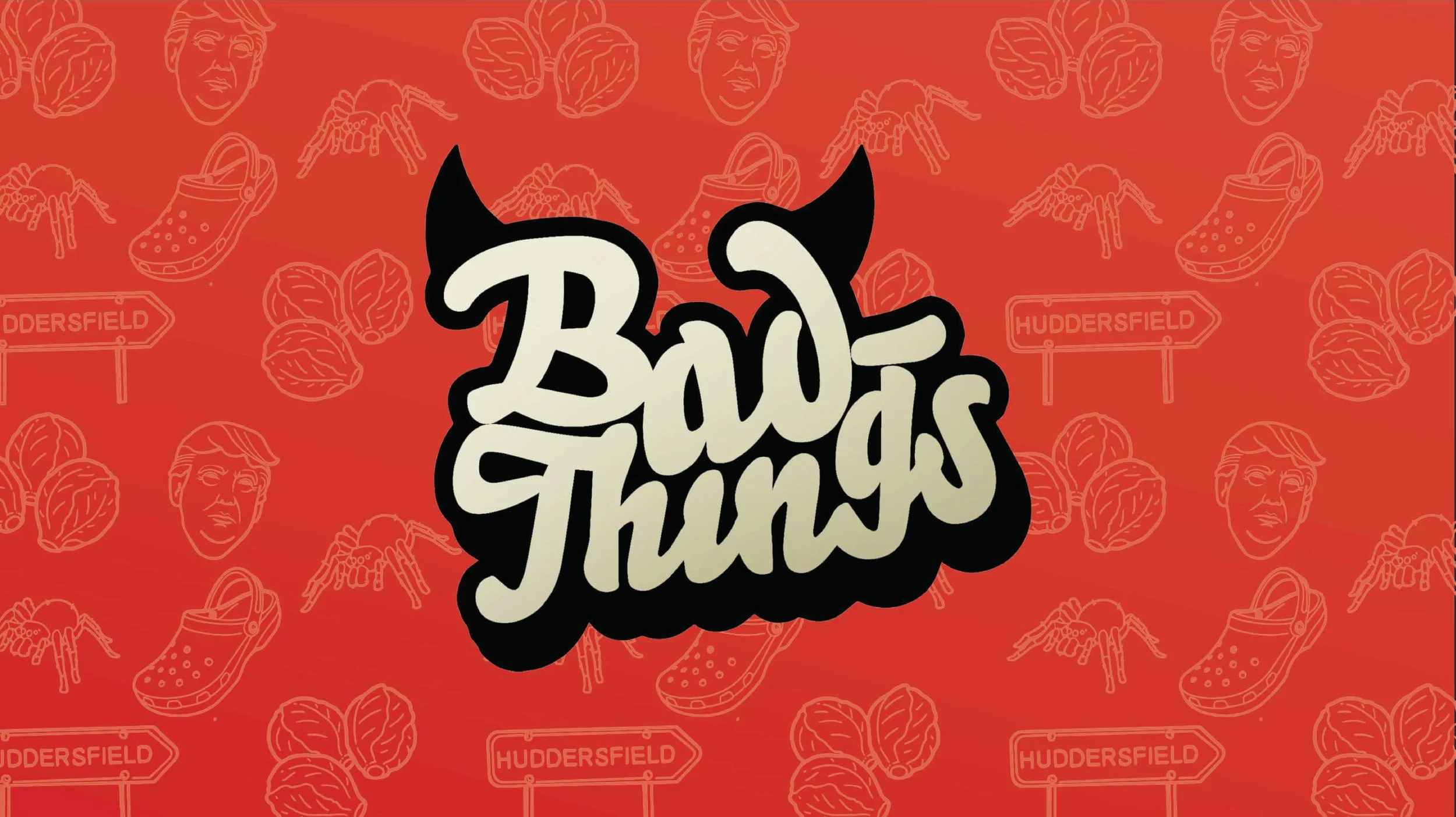
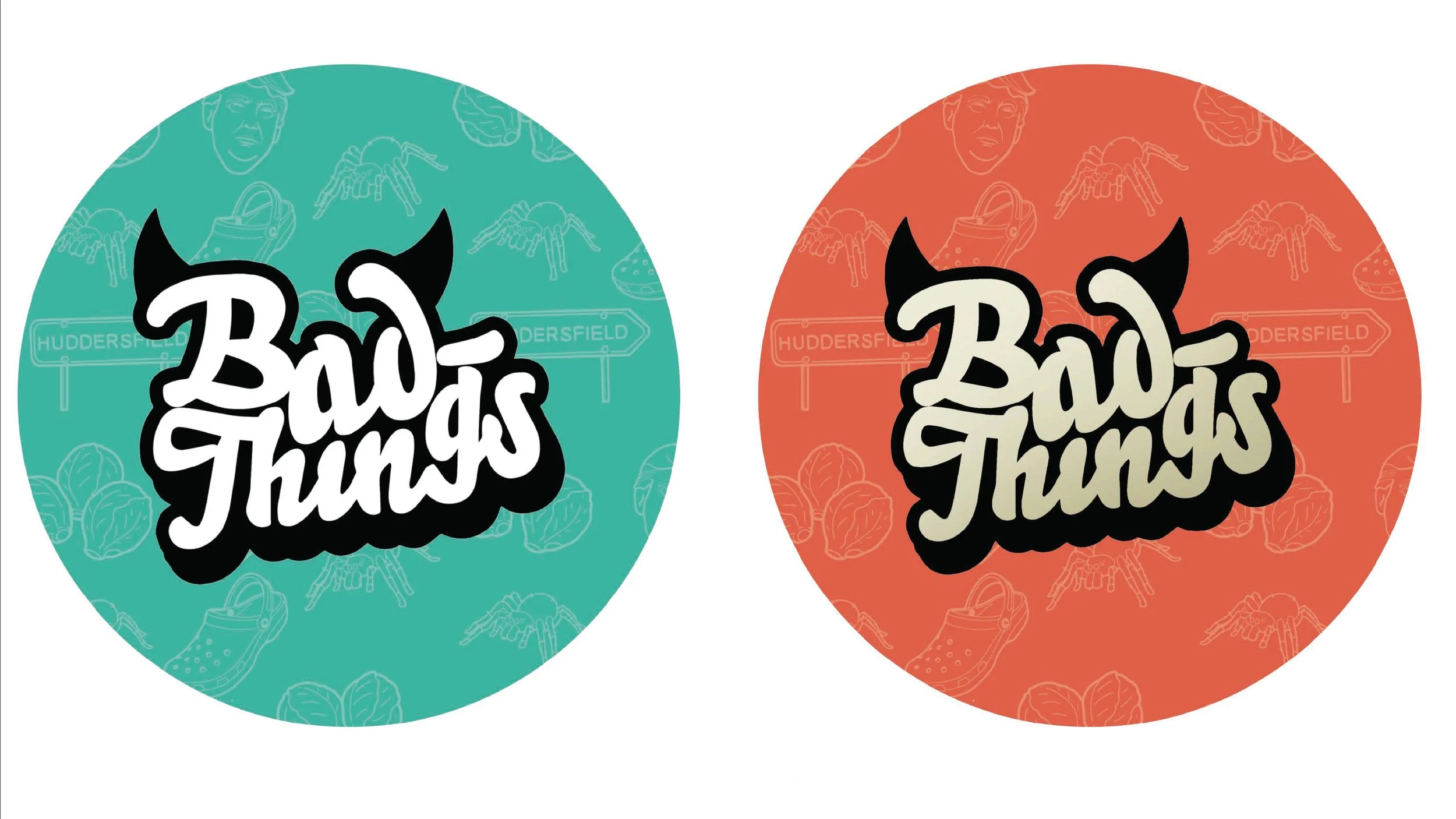
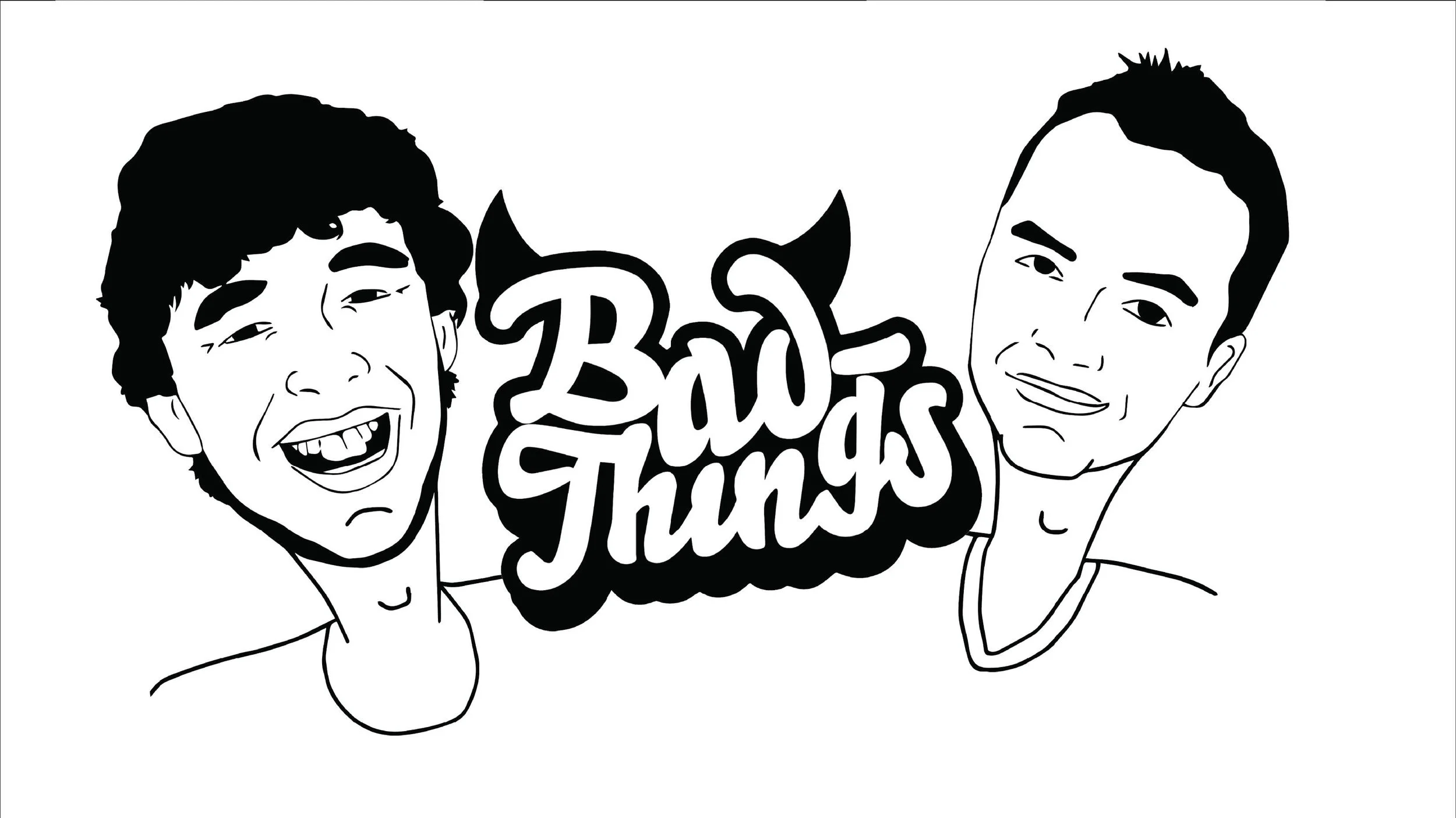
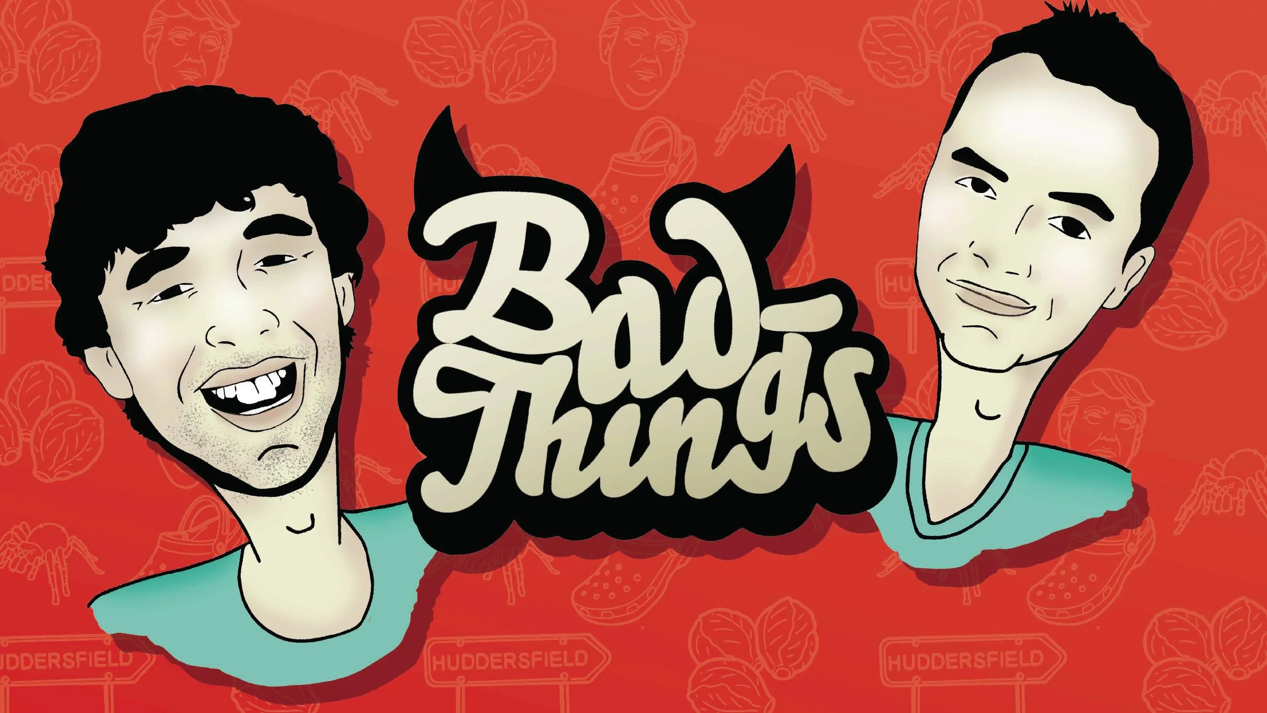
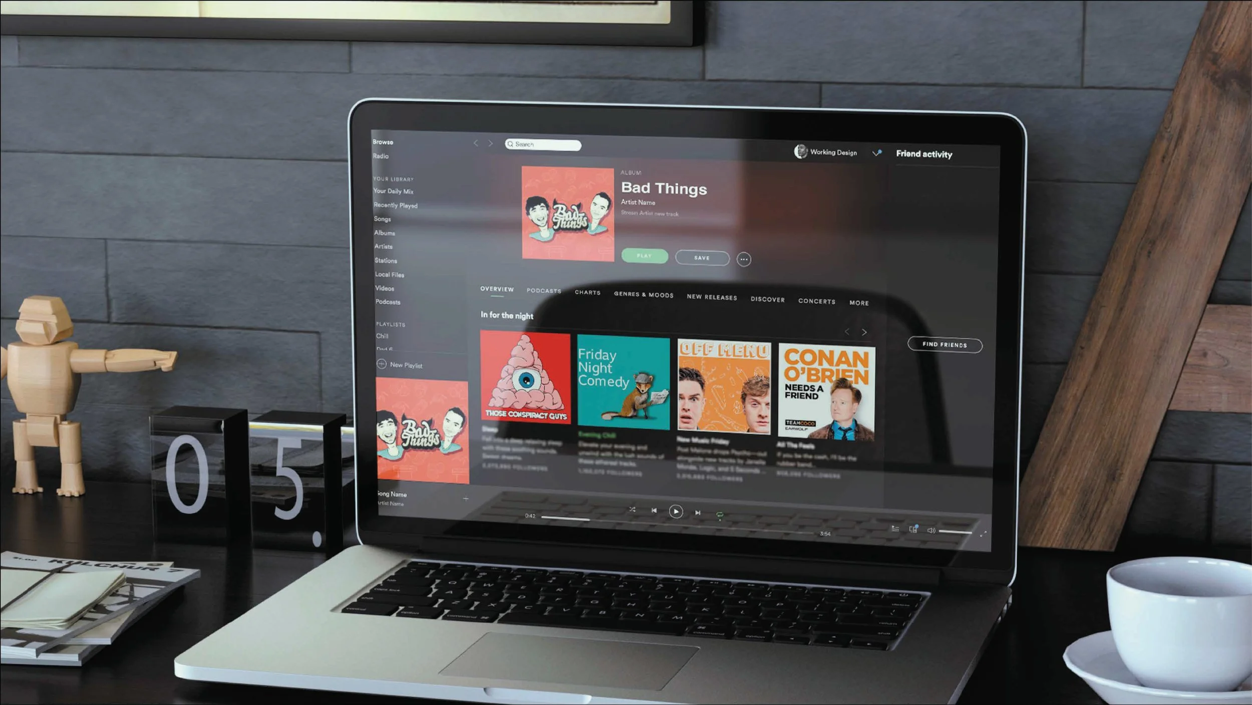
In 2021, I worked on Bad Things, a podcast available on Spotify and Apple Podcasts, creating the cover artwork and overall illustration style for the series. Across two seasons, I developed original illustrated assets for individual episodes, helping give the podcast a distinctive and consistent visual identity. The concept compared “bad things”, from Huddersfield to Crocs, so the artwork needed to feel playful, bold and full of personality while still working clearly across digital platforms.
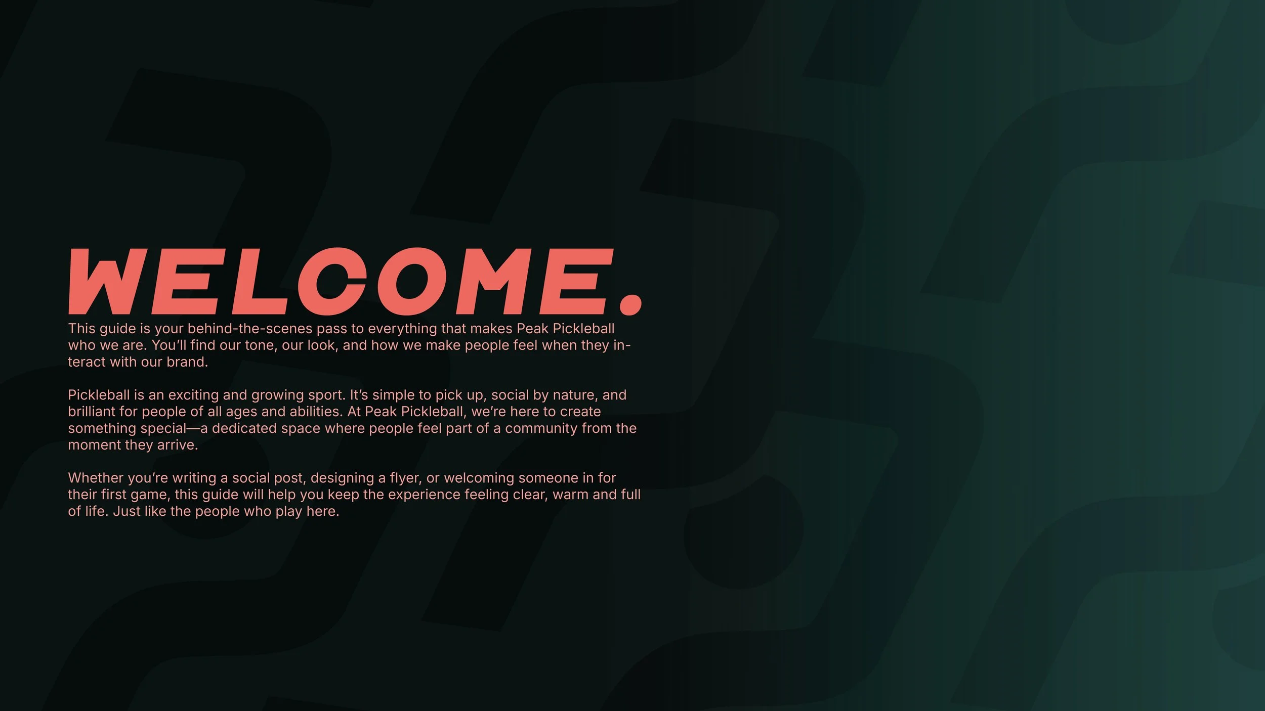
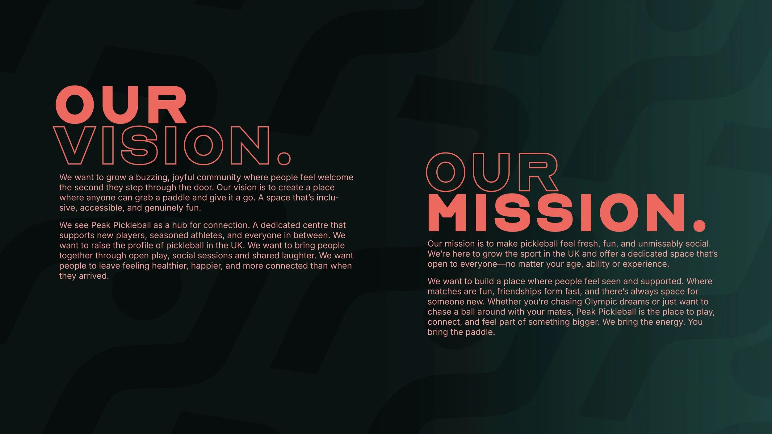
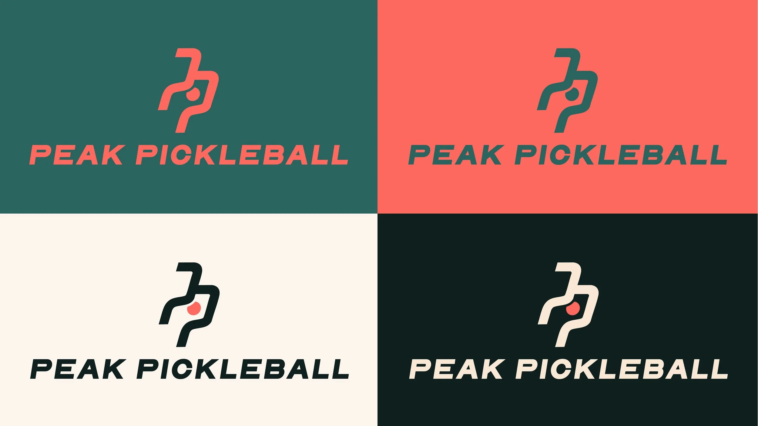
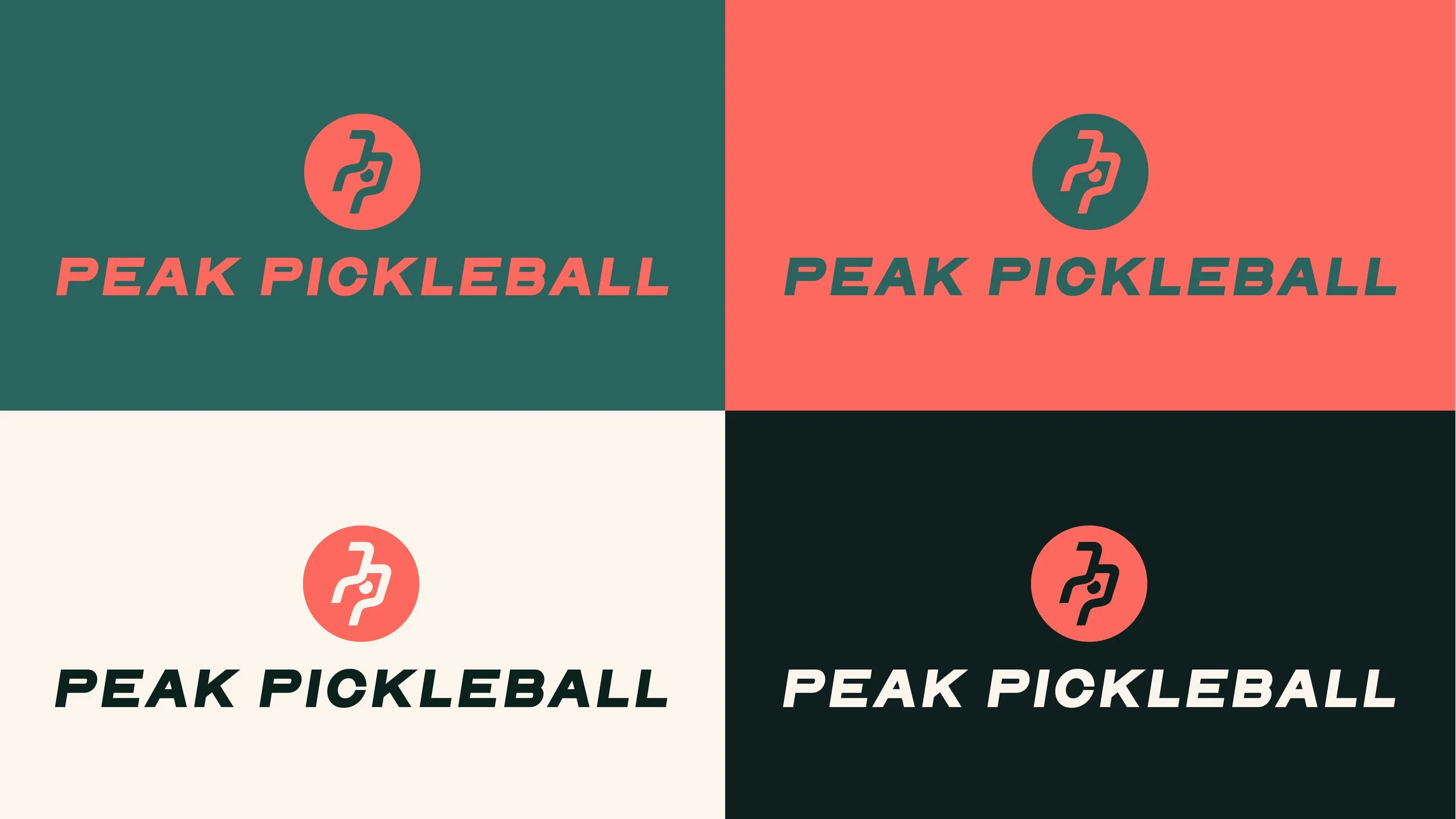
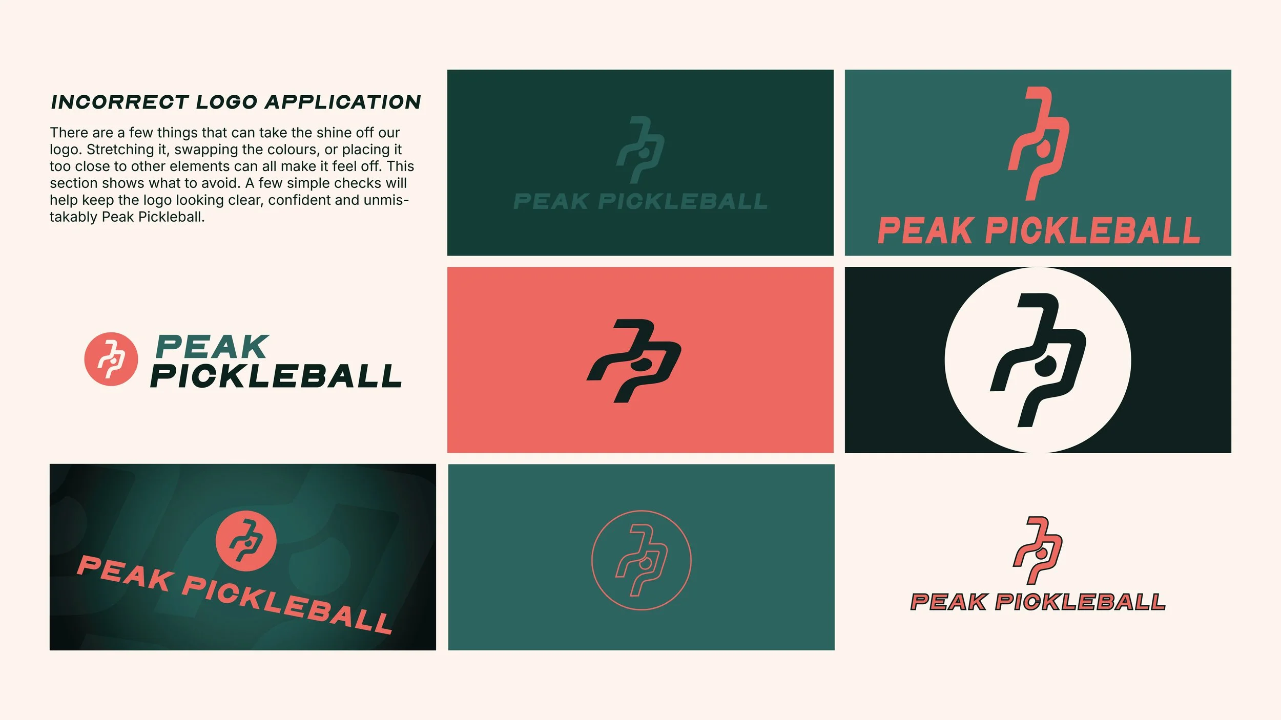
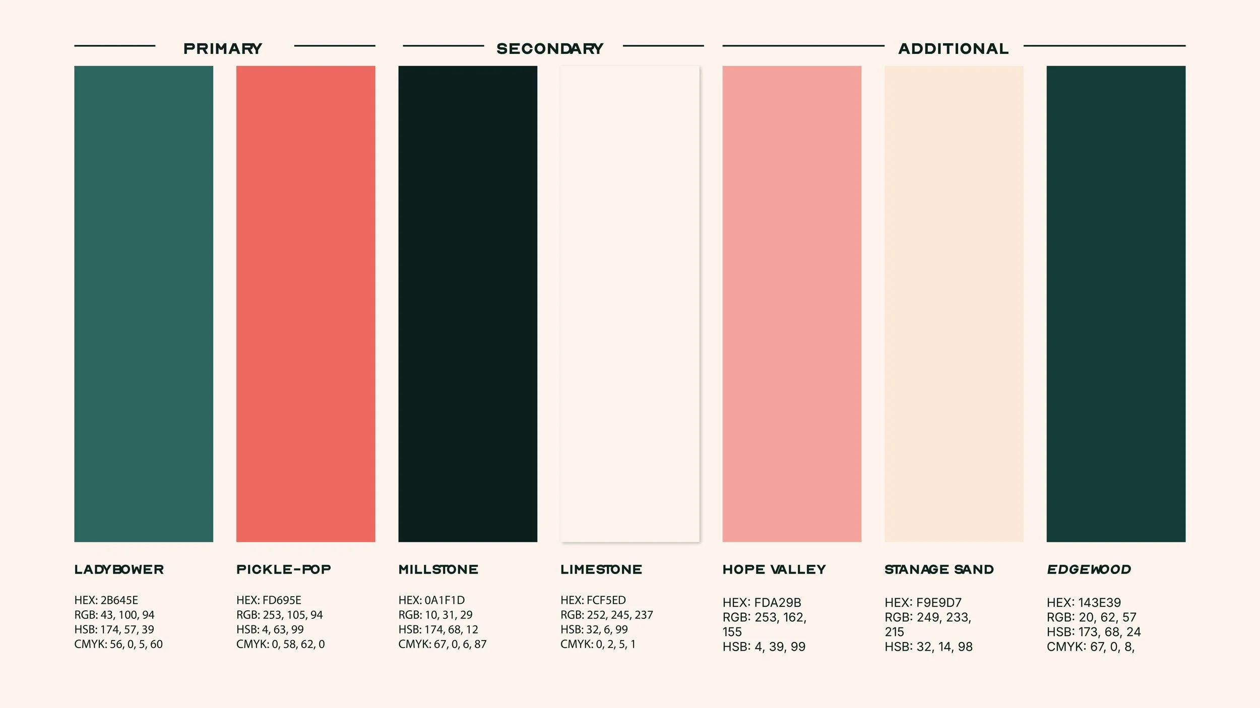
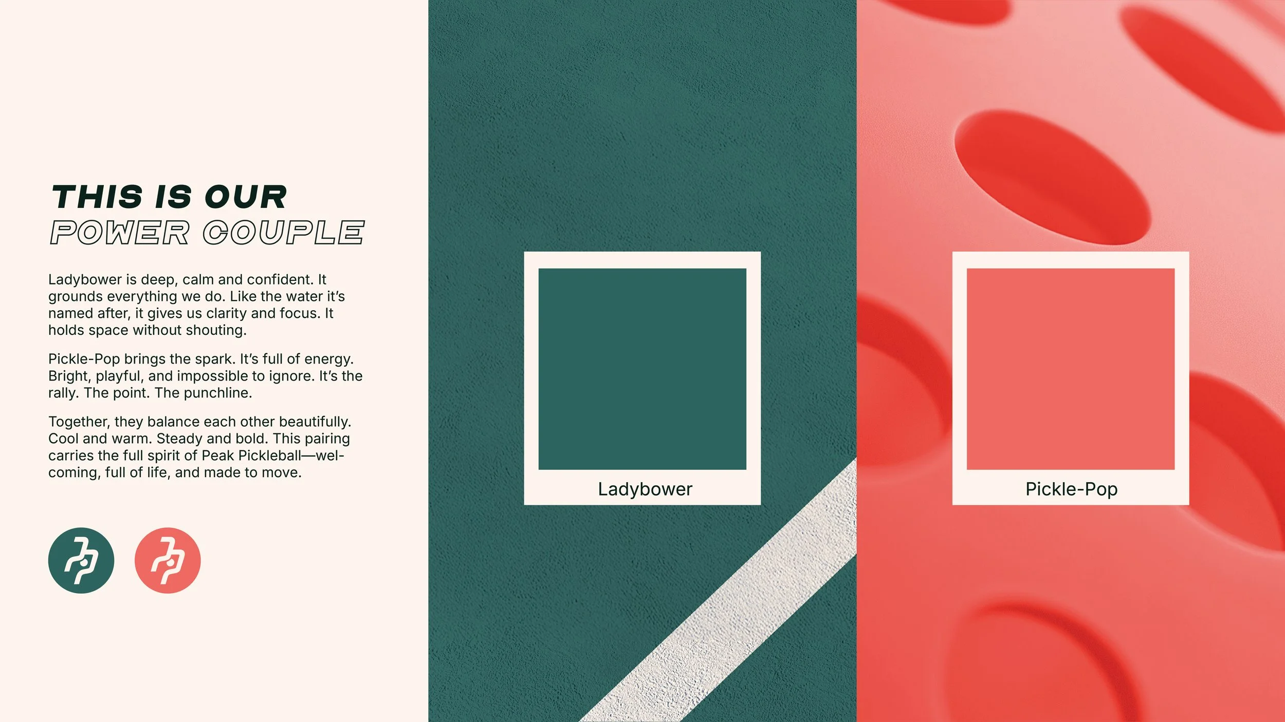
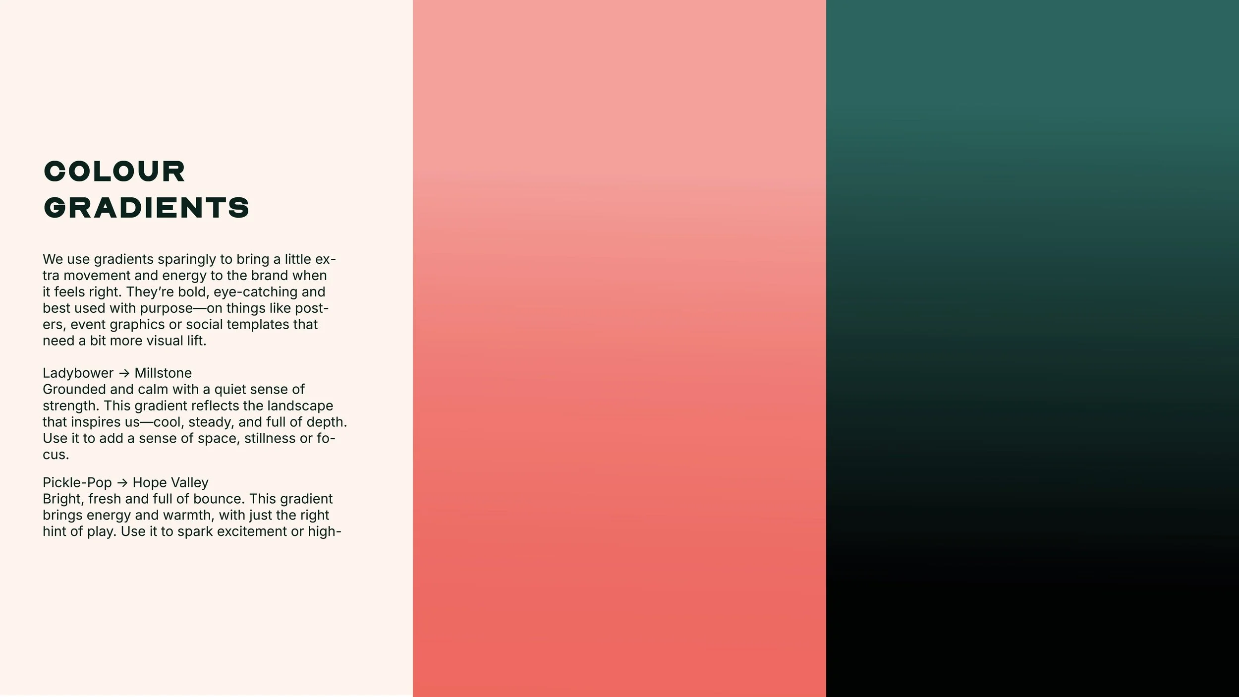
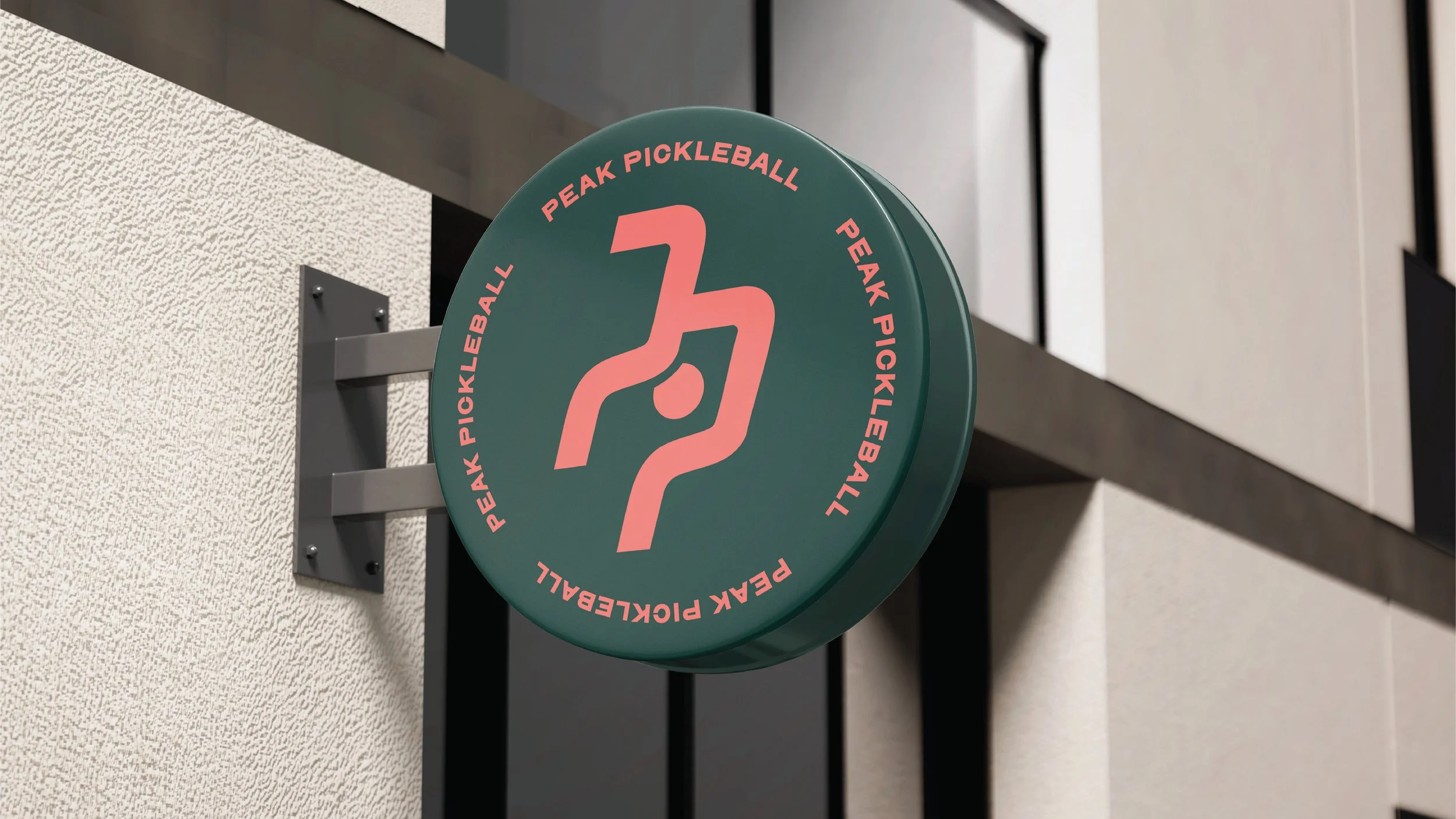
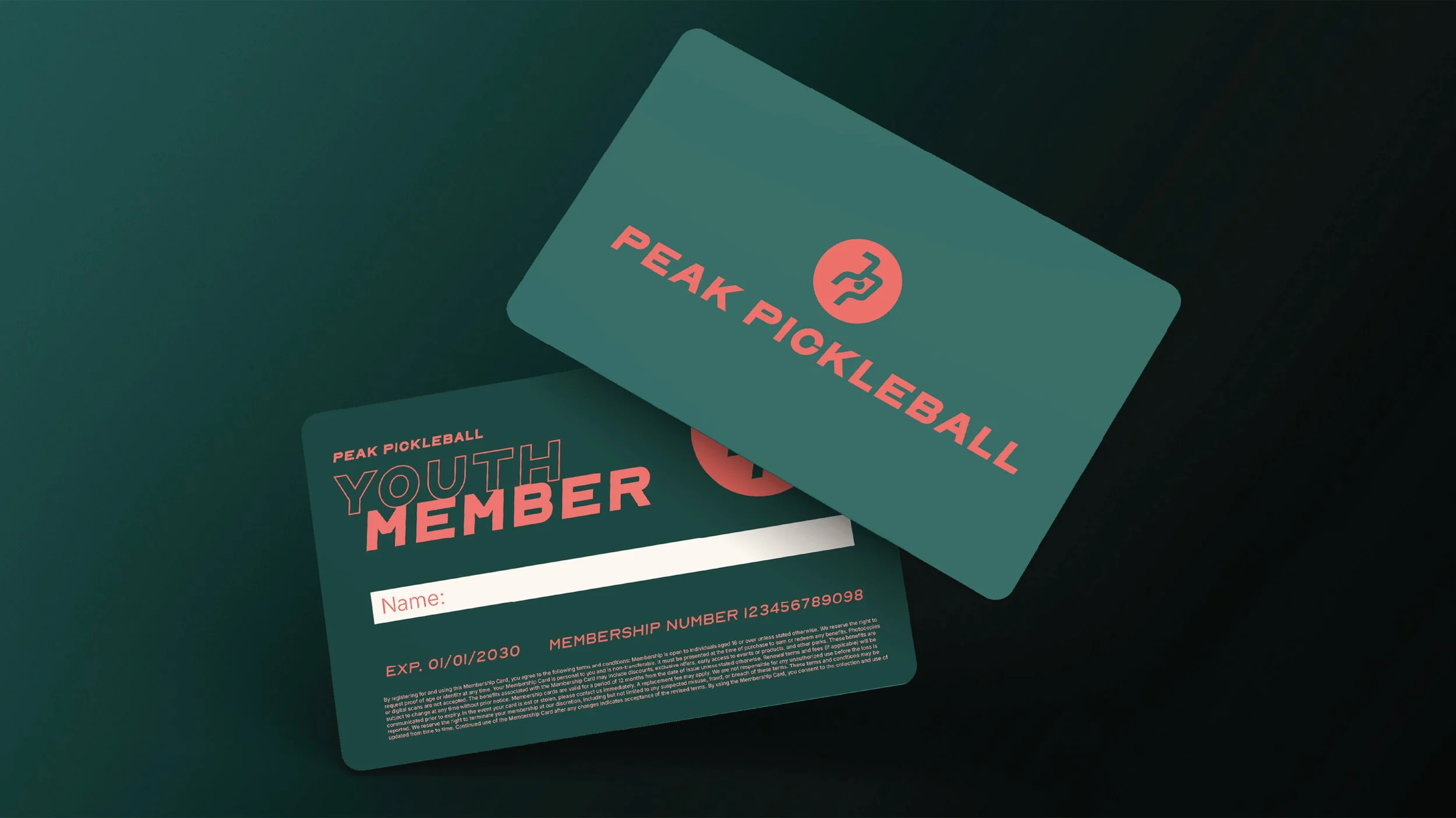
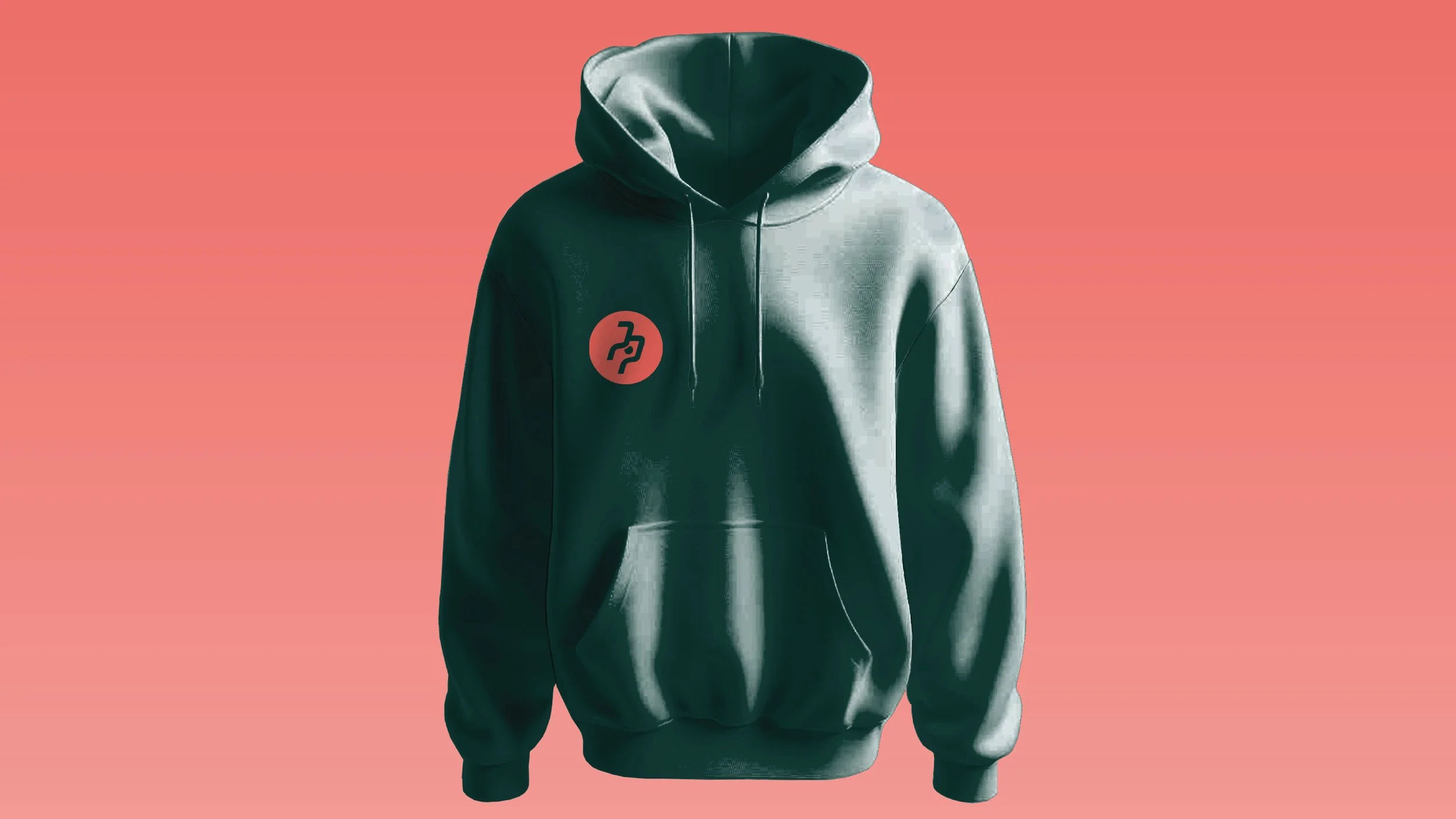
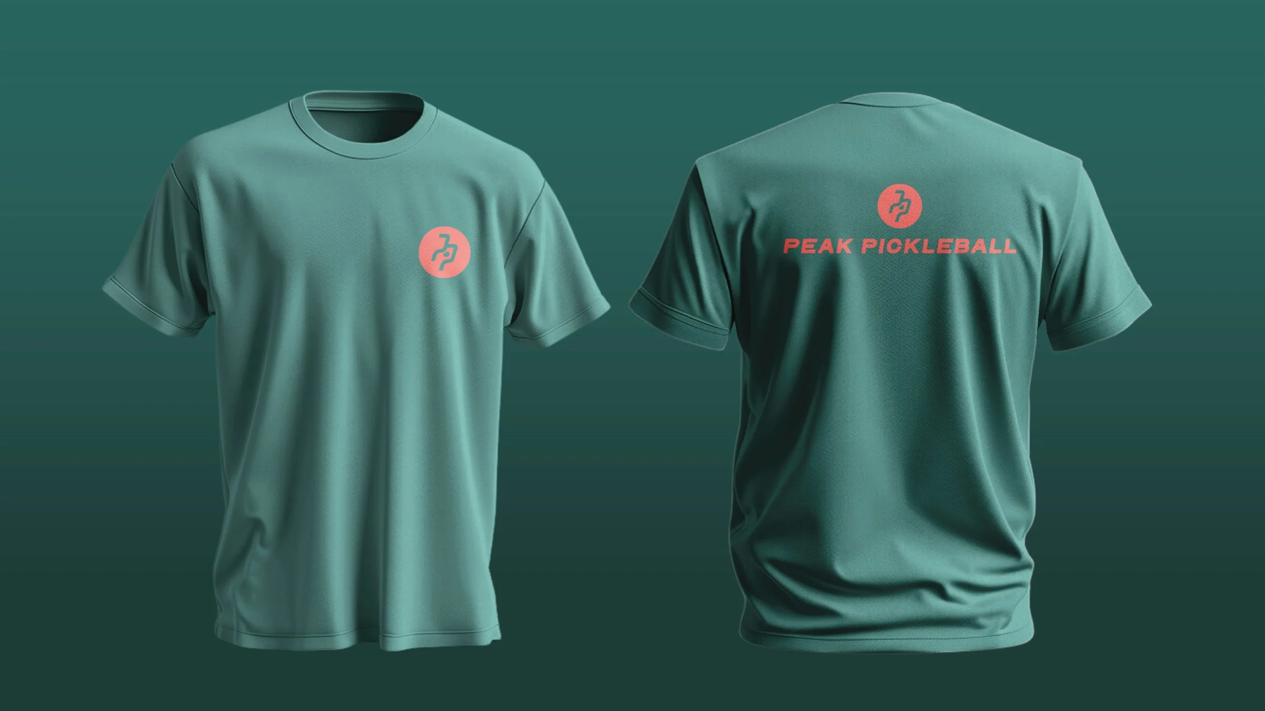
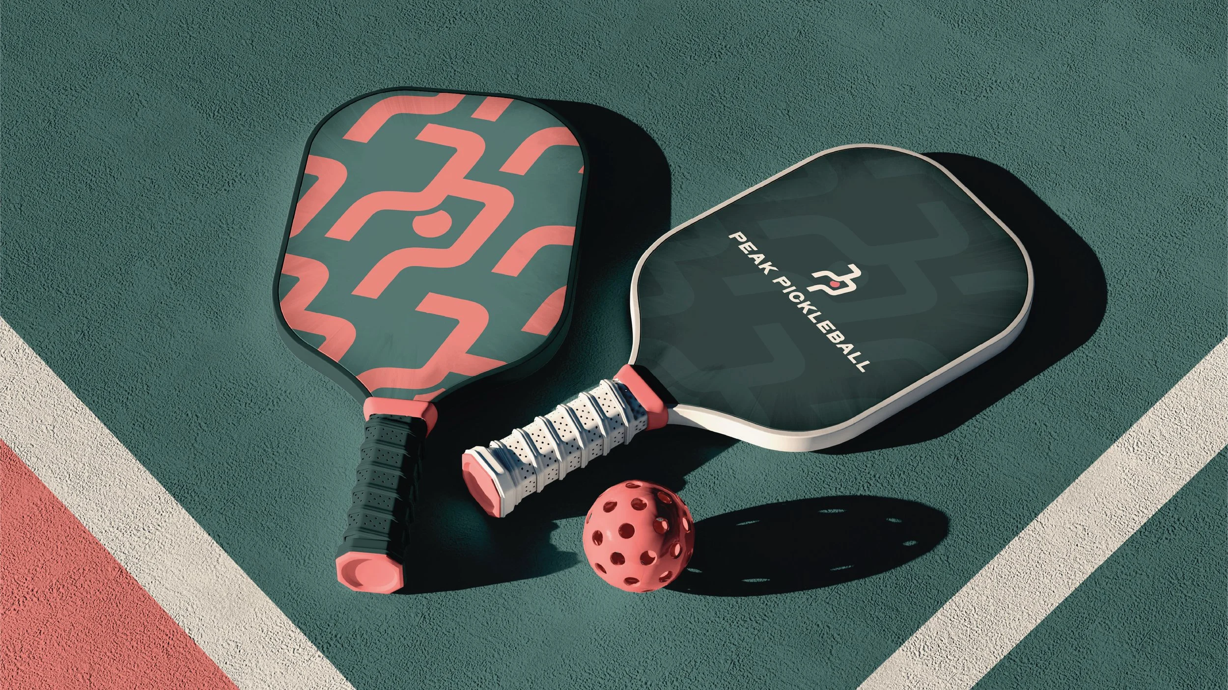
In 2024-2026, I worked with Peak Pickleball, a Sheffield-based pickleball start-up, to create the brand from the ground up. I developed the full visual identity, including the logo, colour palette, typography and wider brand system, before bringing everything together into a complete brand book. I also designed and built the website, making sure the identity worked consistently across every touchpoint and gave the new business a clear, energetic and recognisable presence from launch.
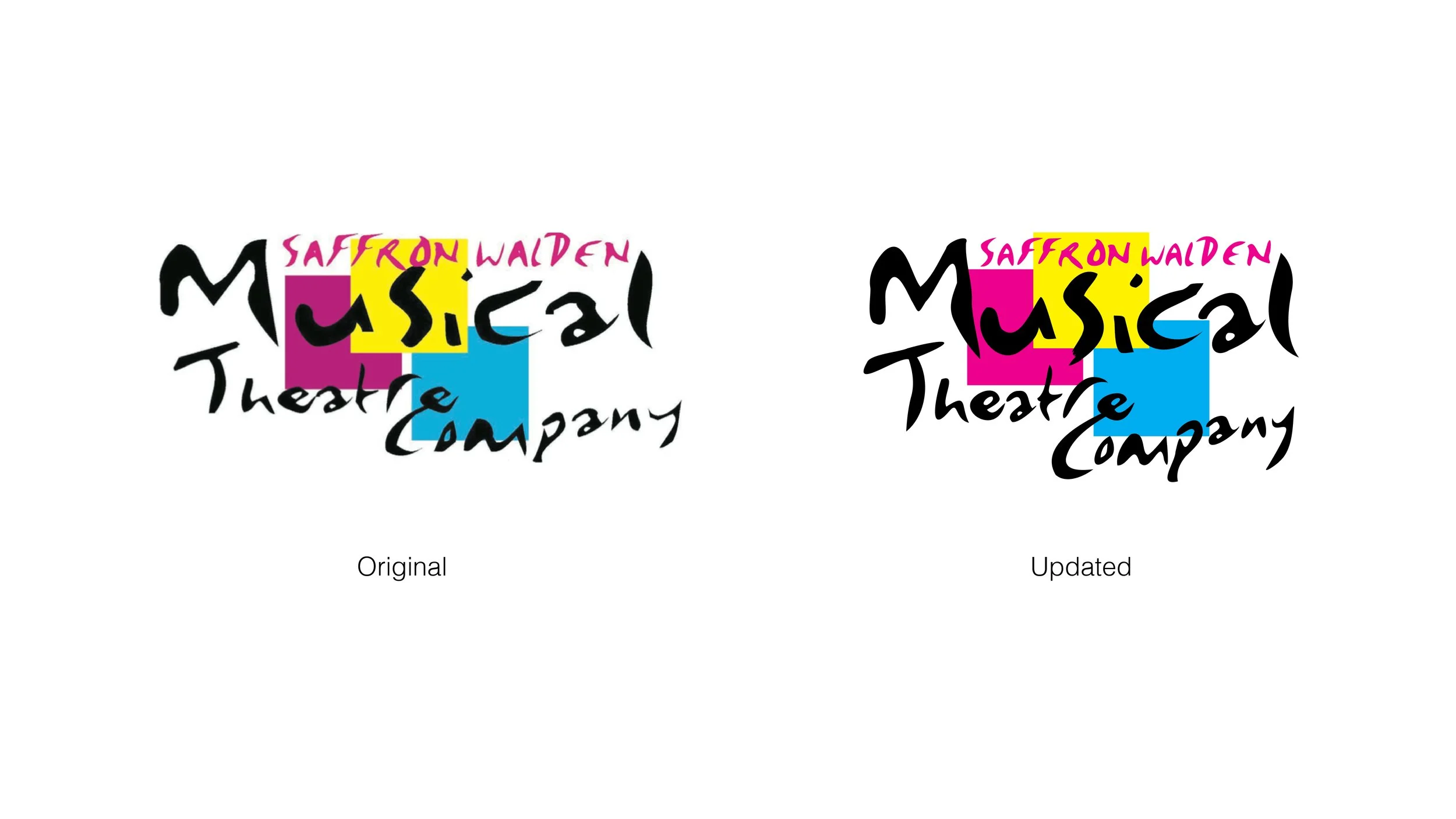
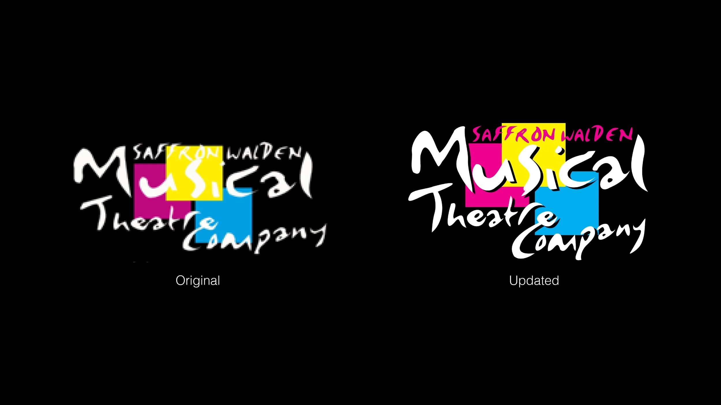
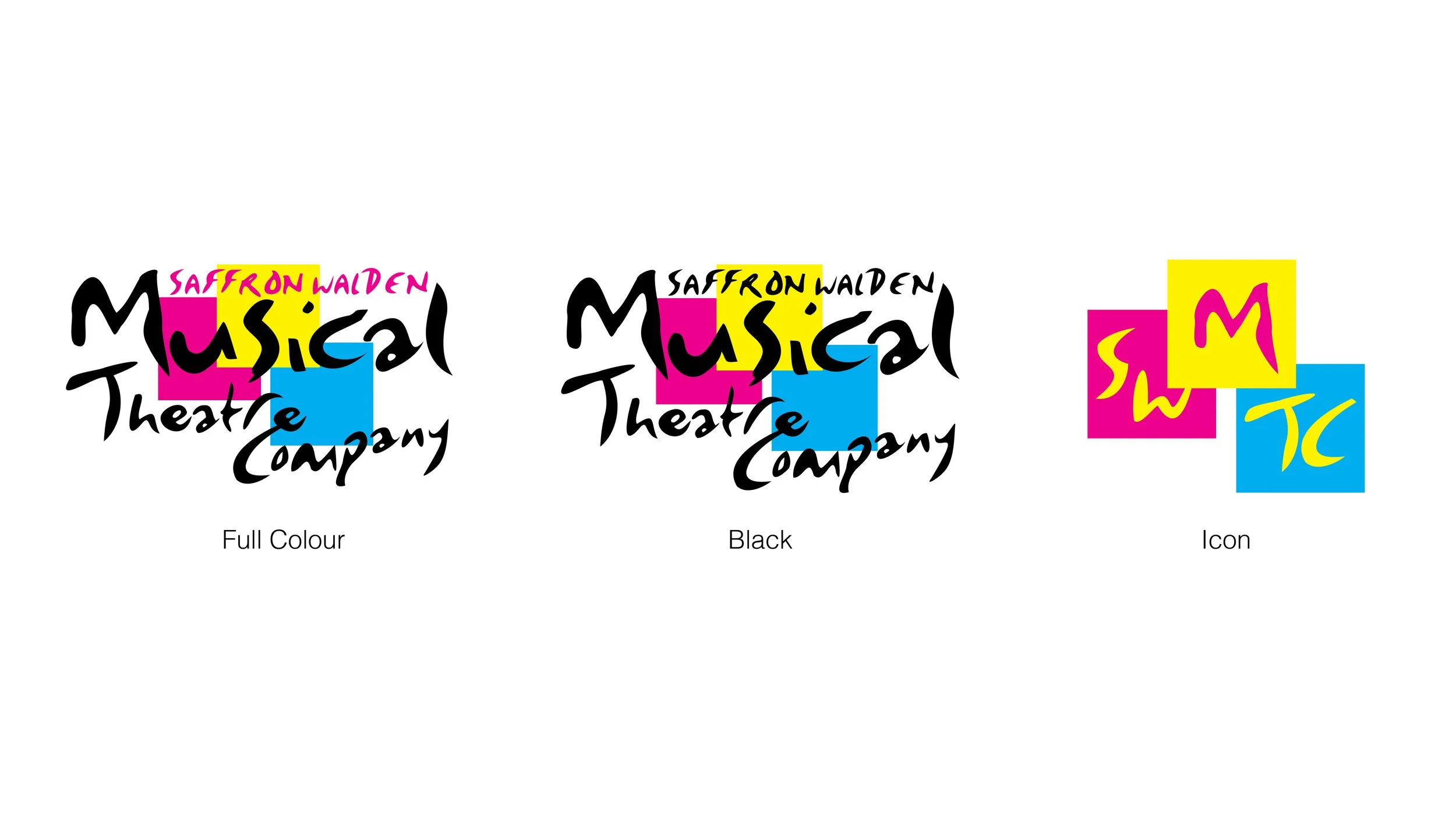
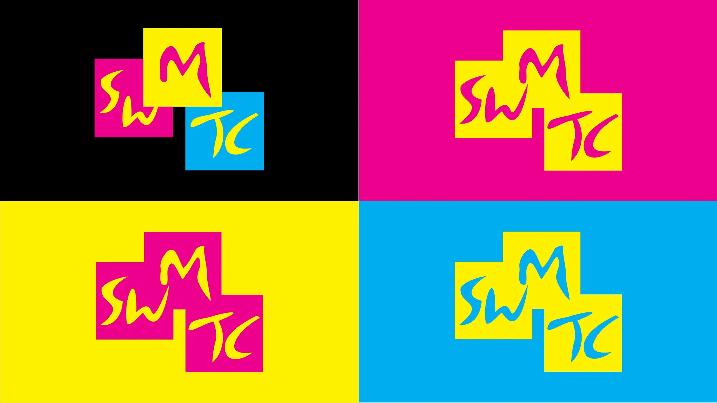
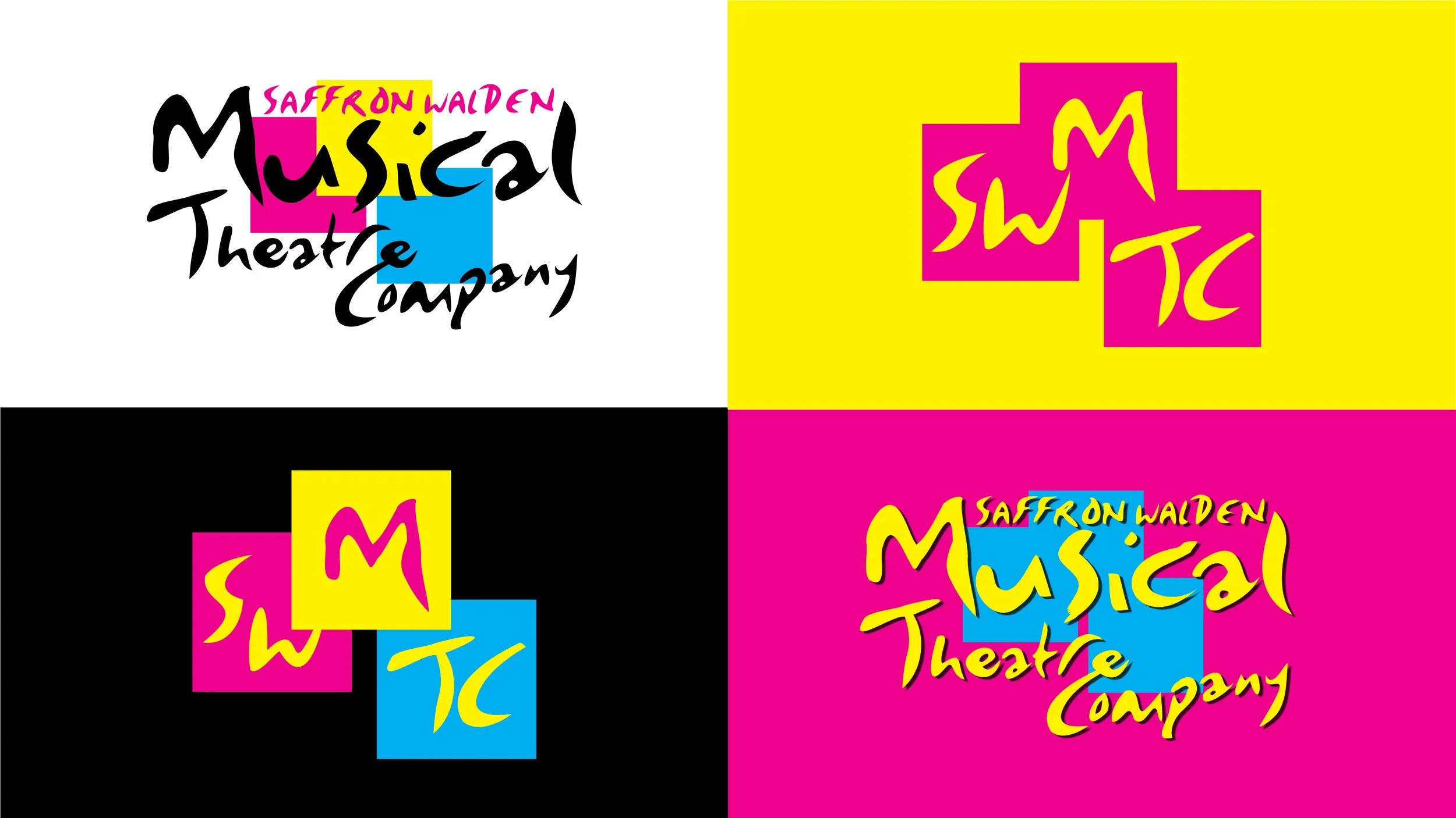
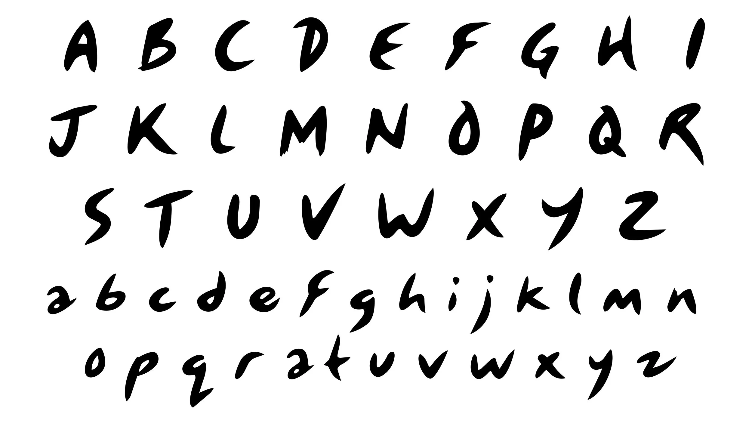
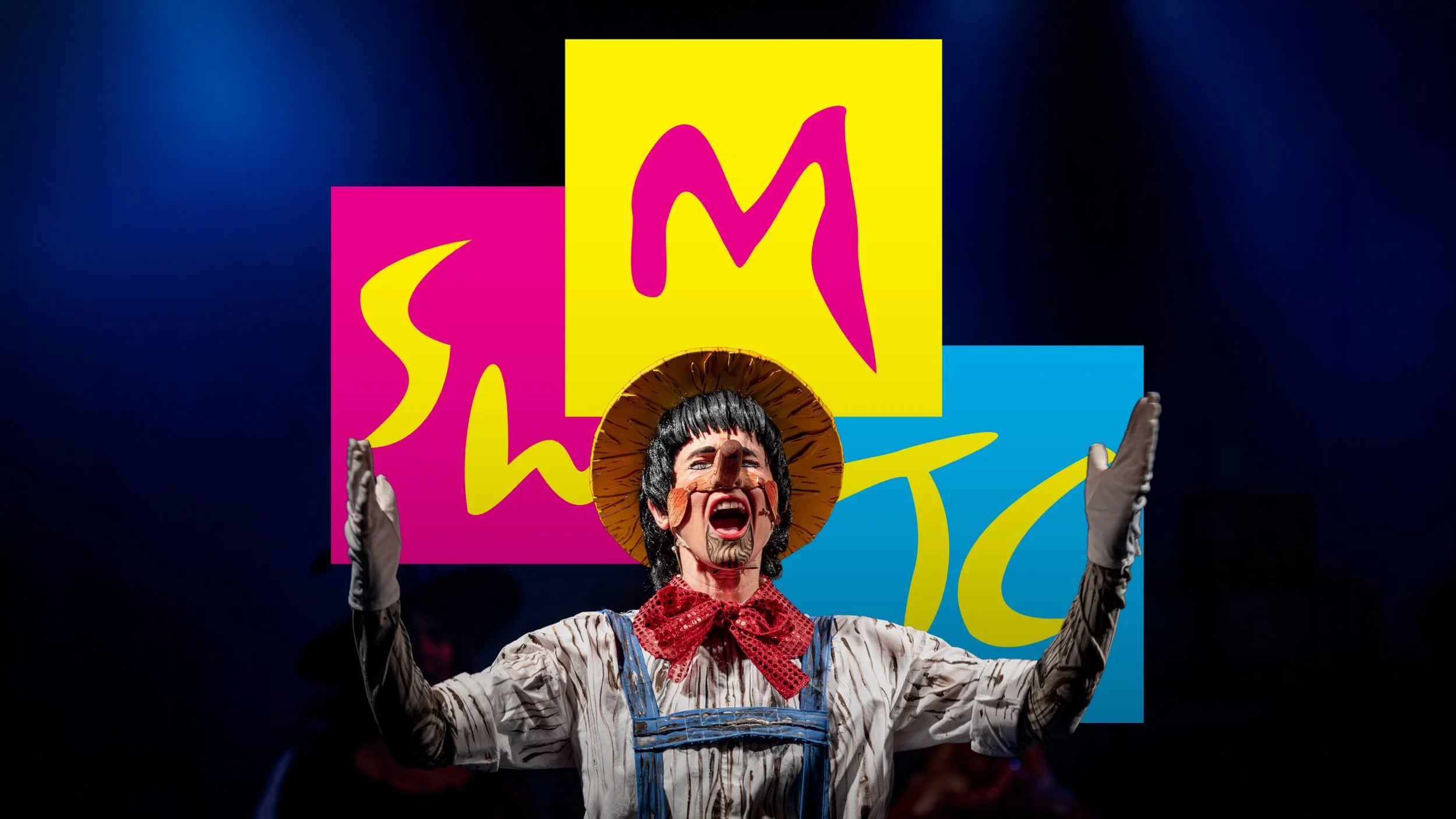
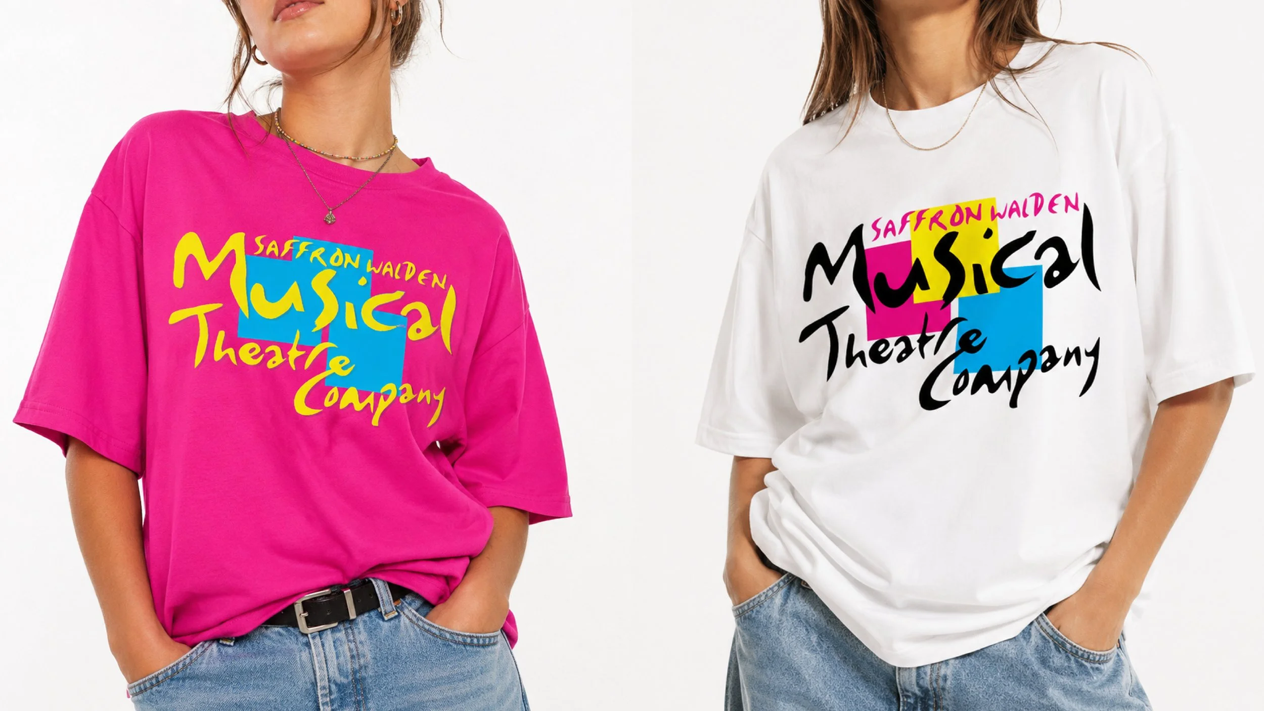
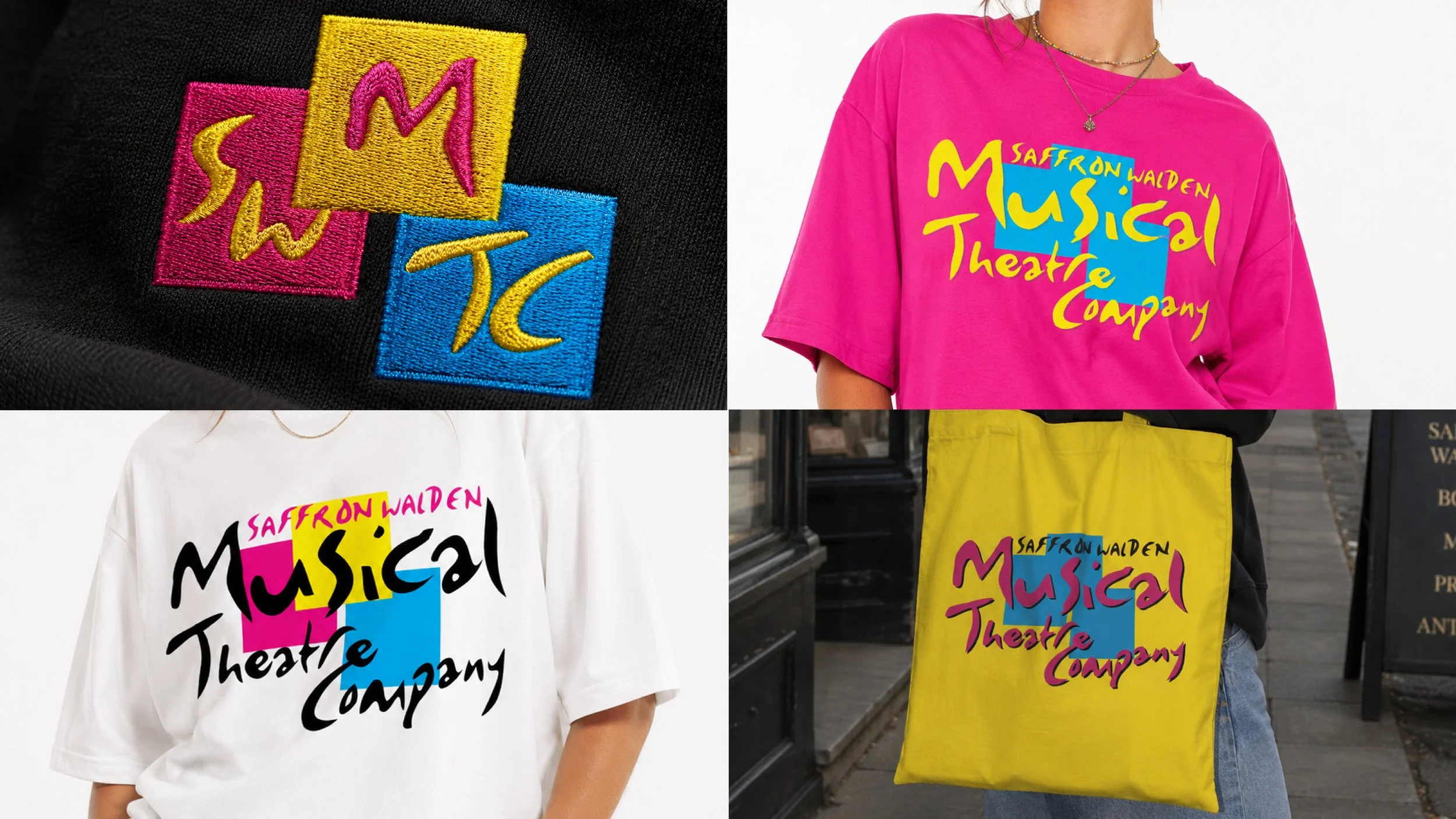
I worked with Saffron Walden Musical Theatre Company to revive their original 1990s logo, carefully redrawing and refining it into a clean, usable vector identity while keeping the character of the original design intact. I then developed a series of playful variations of the logo for fundraising merchandise and wider company use, giving an established local identity a fresh lease of life without losing what made it recognisable in the first place.